WHEN TWO WALK-IN ROBES ARE BETTER THAN ONE…
When we design a main bedroom or parents’ retreat, creating a sanctuary for relaxation and rejuvenation is always top of mind. A space that effortlessly blends luxury, comfort, and functionality for the parents to have somewhere of their own to escape a busy family home.
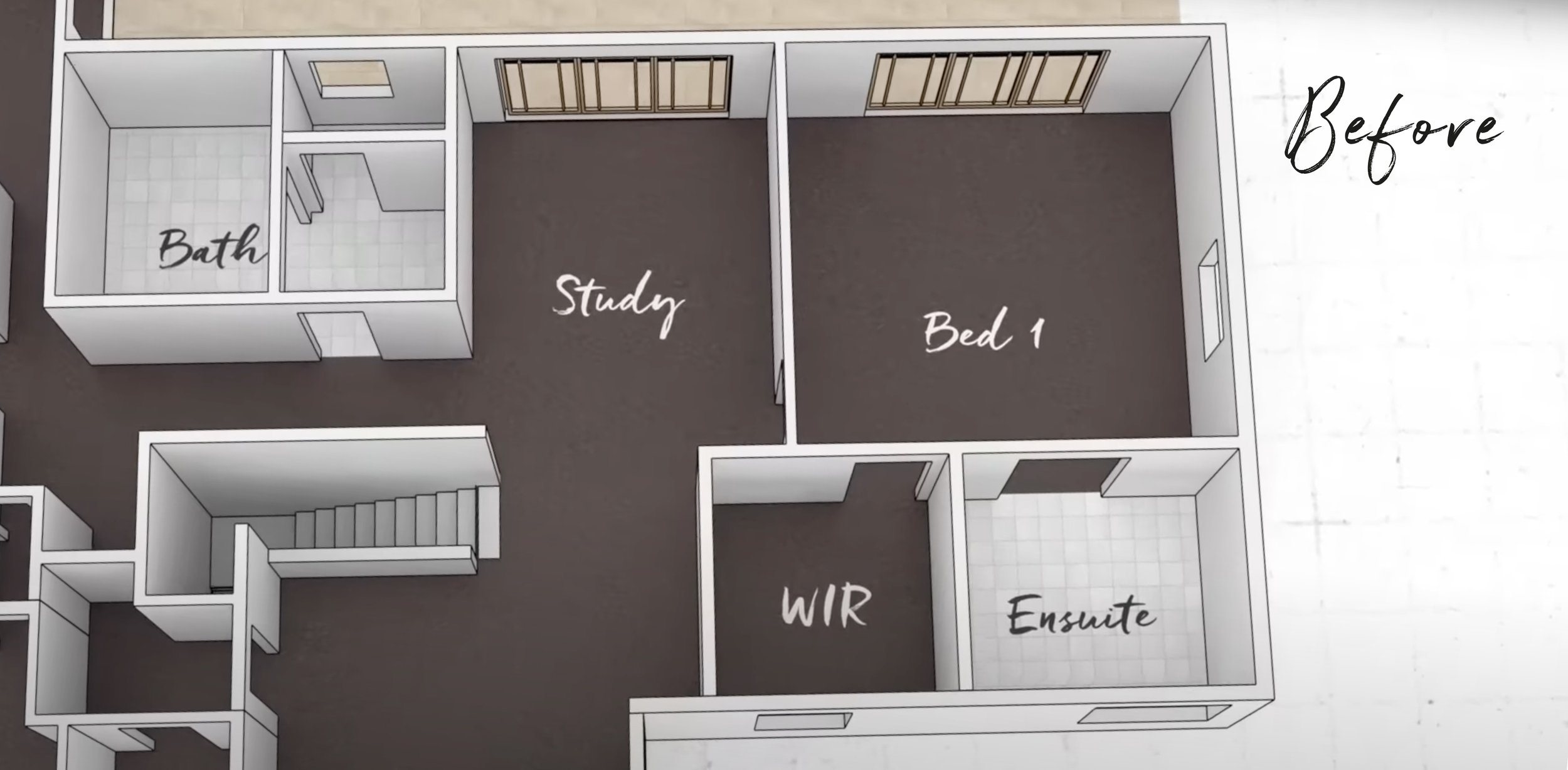
Located at the top of the stairs, Erin and Nathan’s bedroom already had a modestly sized ensuite and a small walk-in robe but being a storage lover, Erin craved more space to hang clothes and a more functional bathroom.
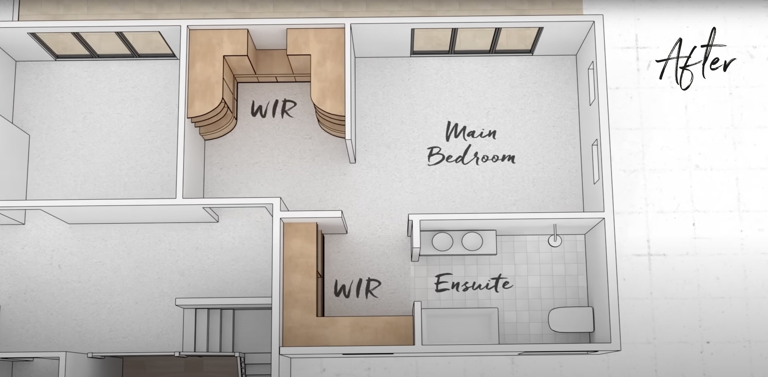
With this in mind, we reconfigured the space, borrowing some from the previous open study area, to create Erin’s dream bedroom. Here’s how we did it…
THE BEDROOM
With doors to an outside balcony and of the garden, the existing sleeping quarters didn’t require any changes to the location or size. We closed off the ensuite door (and said goodbye to the view of the loo from the bed!) and relocated it so the entry is now via the existing walk-in robe. Reducing the number of doorways along this wall makes the bedroom feel bigger, as does the wider entryway we created which leads to the new walk-in robe.
Honourable mentions in Erin’s beautiful bedroom must go to:
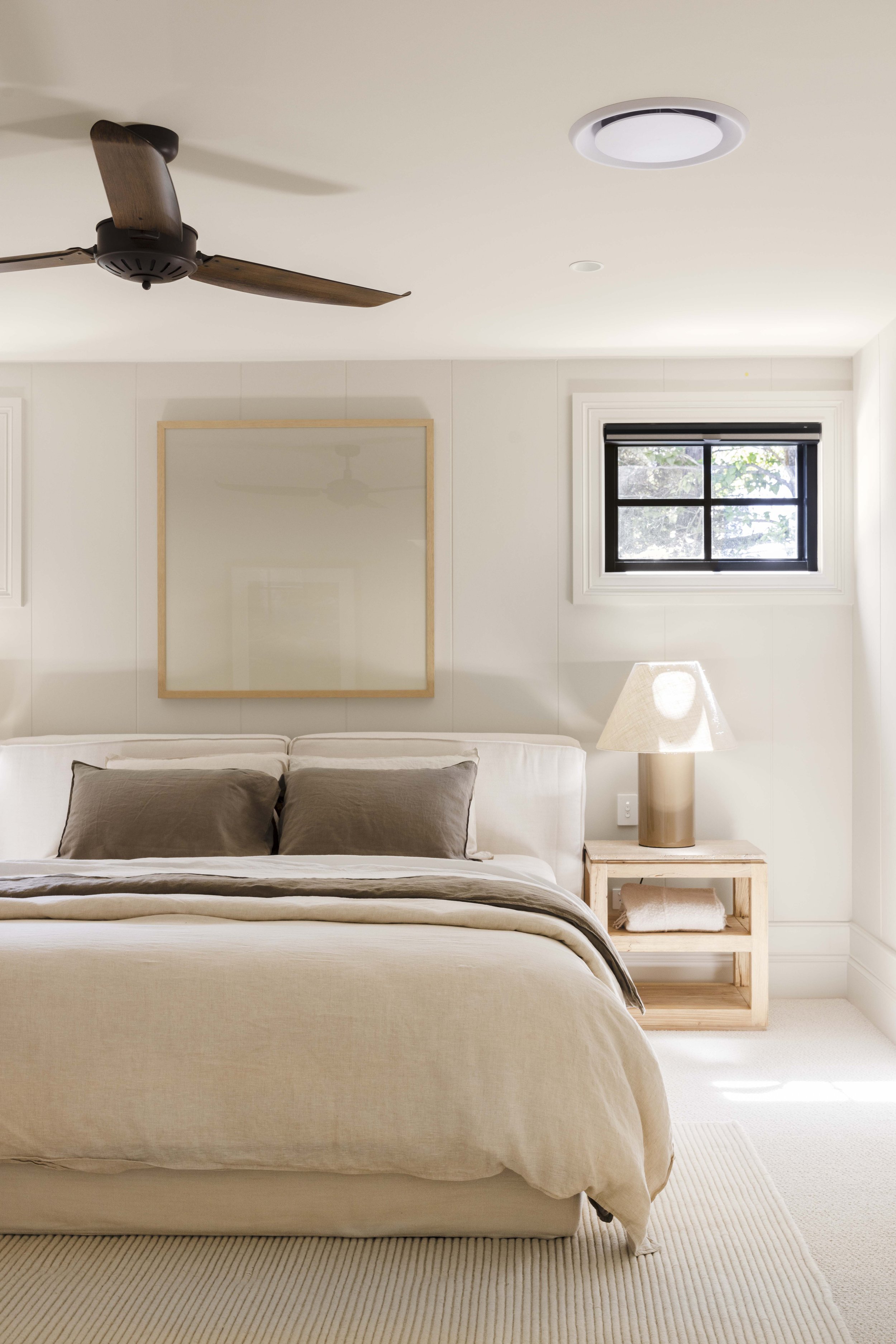
✔️ The dreamy colour palette - Throughout the home, we used Dulux Buff It Half on the walls but because this room is elevated and already had a lot of natural light, Bonnie chose the darker full-strength Dulux Buff It on walls, trims and ceiling to give this room a warm, cocoon-like glow.
✔️ Wall detailing - Bonnie will tell anyone who’ll listen that skirting and architraves can totally make or break a room. In this bedroom, the huge 300mm Intrim skirts with the decorative skirting blocks between the archs and skirts paired with the Axon Cladding on the walls (with a gorgeous extra wide 400mm groove) definitely up the luxury level!
✔️ Luxe furnishings and bedding - speaking of luxury, a lush bed and linens are essential items for a beautiful bedroom. We chose the new MCM House Elio bed as the centrepiece and couldn’t go past their side tables, bedside lamps and French linen bedding to finish it off.
THE ENSUITE
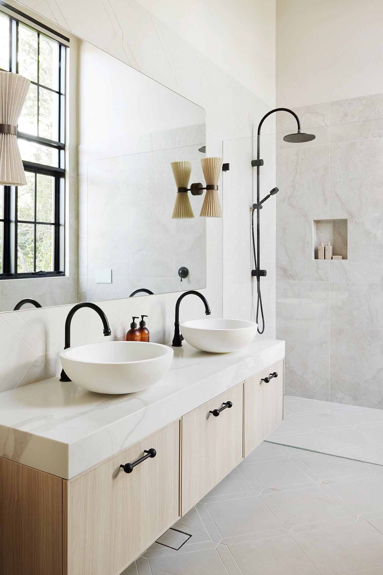
Despite the small size of the ensuite, Erin was committed to fitting her entire wishlist, including a double vanity, bath, shower and toilet. It’s a lot in a little space but she was willing to compromise on layout to achieve this. And at the end of the day, renovating is all about compromise!
Although it was one of the most challenging rooms to design, it’s now Bonnie’s favourite room in the house. Erin’s ensuite love list includes:
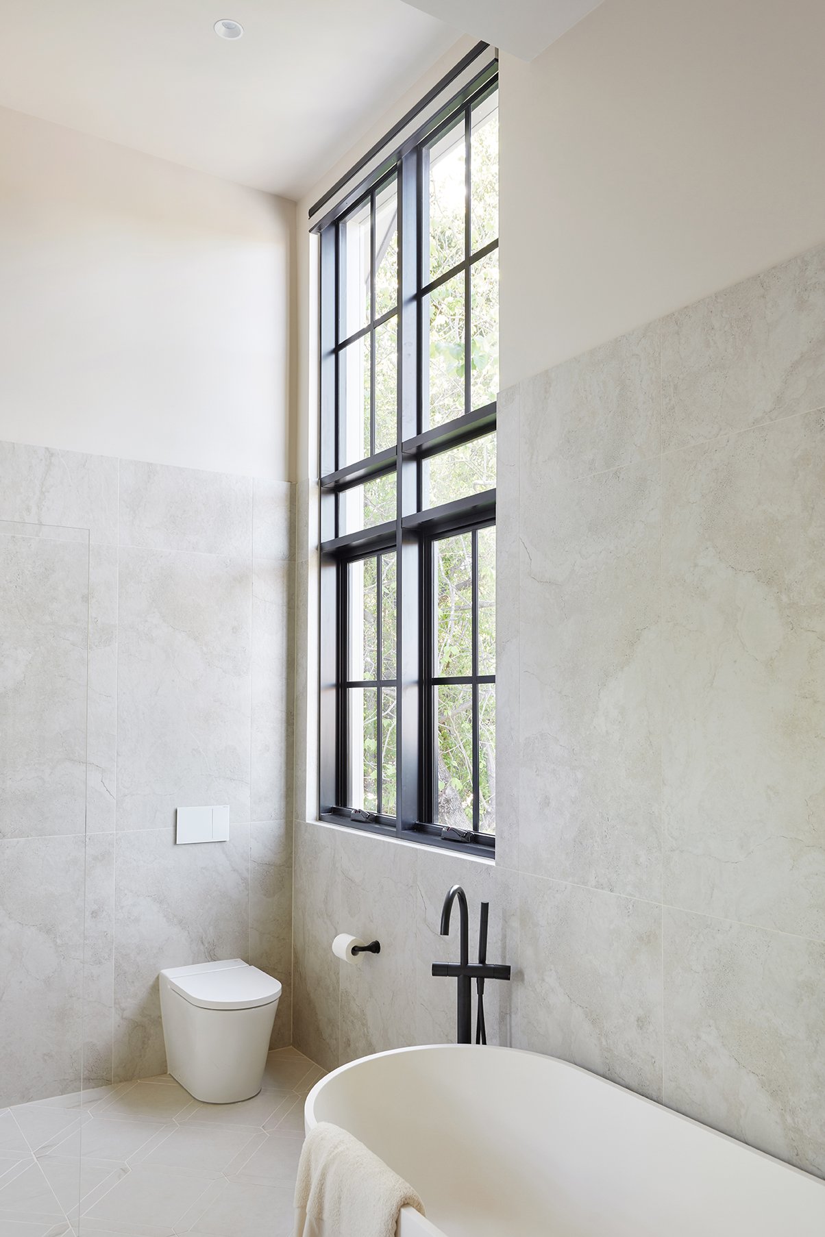
✔️ The windows - the stunning new Stegbar windows are a feature due to their size. There were always windows in this space but the striking new black frames makes them a highlight.
✔️ Picket tile perfection - you might recognise the square floor tiles from the laundry - they’re the TileCloud Arrawarra. This time we’ve added a picket border which elevates them for an extra luxe look.
✔️ The Bath - the freestanding bath from Reece was the first thing Erin picked for the ensuite and it’s lucky she still loves it because it was no mean feat getting it into the space. The sheer act of getting it up to this level of the house before the new stairs were built and the jiggling of ensuite measurements to ensure it fits were nerve-racking moments in this reno!
TWO WALK-IN ROBES
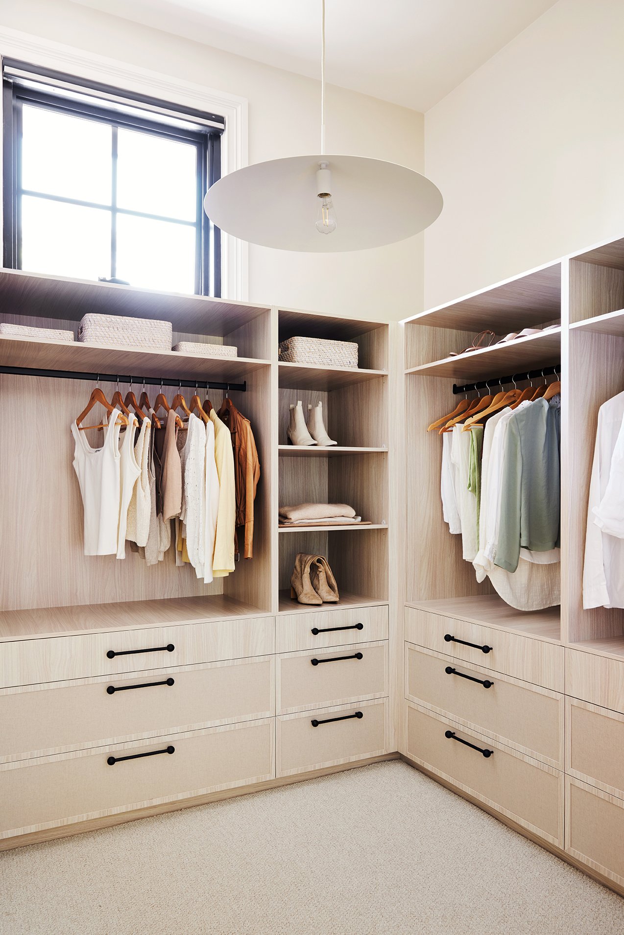
The existing robe wasn’t huge to start with and then moving the ensuite door meant losing storage space along one wall. The solution to gain more storage space? Build another walk-in robe!
It may sound extravagant but in the case of Erin’s bedroom, an additional WIR was actually a more cost-effective solution than attempting to relocate or resize the existing wardrobe. That would have required costly structural changes but instead we got lucky that there was some space up for grabs right next to the bedroom that we could use. It had previously been used as a study but with the new dedicated study downstairs, reconfiguring this space into an additional walk-in robe for more storage was a logical use of space for Erin and Nathan.
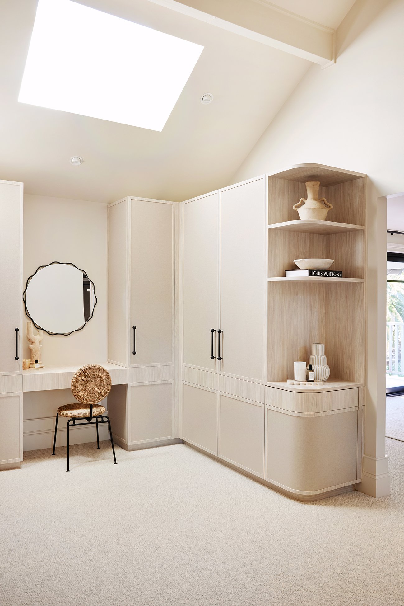
✔️ Linen look cabinetry - We used this finish internally in the walk-in robe at House 15 and loved it so much we’ve used it again, externally this time! Although it looks like delicate linen, it’s actually a durable Polytec finish so it won’t be easily marked.
✔️ Carpet - Carpet in the upstairs rooms was a must for Erin and this brand new bouclé carpet from EC Carpets was a perfect choice. It’s cosy underfoot and exudes elegance.
✔️ The balance of pretty & practical - The key challenge when designing these robes was getting the balance right between hanging room, drawers, open shelves and doors. With the two spaces we were able to strike the right ratio, including some beautiful display shelving to make the space feel extra special. It’s all class, just like Erin.
Seen something else you love? Click the link to shop Erin’s bedroom.

