COULD THESE BE OUR BEST KIDS’ ROOMS EVER?
With nine kids between us, we know just how fast they grow, so it’s important to think ahead when designing children’s bedrooms to ensure we’re creating spaces that are as perfect for them now as they will be a few years down the track.
At House 15, we wanted each of the pre-teen girls to have their own special sanctuary that they’ll love as much in the future as they do now, with a bathroom to share in between. It’s a MASSIVE call (and we’ve got video footage to prove it!), but Bonnie’s calling these her FAVOURITE kids’ bedrooms we’ve EVER done!
Do you agree? Let’s take a closer look at what’s to love…
THE BLUE ROOM
When we’re renovating, more often than not, some rooms get a nickname and with two girl’s bedrooms in this house, this one became ‘The Blue Room’. One glimpse at the wardrobes will explain why. That’s the gorgeous ‘Coalition’ by Dulux, the same grey/green/blue we used on the window frames and the colour we’ve hotly debated throughout the house… we’re calling them blue, in this room at least!
Speaking of the wardrobes, rather than just a functional cupboard for hanging clothes, these ones are a real moment in the room. We added Intrim Half Round trims to each door to up the curve factor and beautiful travertine arched handles from Lo&Co to bring the luxe vibes.
Because this bedroom is a great size, it lent itself to a queen-sized bed, and the stunning wavy bed frame from Create Estate was just meant to be. We centred it under one of the beautiful arched windows and chose a colour palette for the bedding that’s almost good enough to eat.
Although window coverings are essential in a bedroom, we didn’t want to detract from the form and colour of the arched blue window frames so we hung the Luxaflex Pirouette Shadings above them. This is an excellent solution for covering arched windows in any room where you need window coverings but don’t want to hide the arched detail when they’re open. Pirouette shadings are made from soft horizontal fabric vanes that float on a sheer backing allowing you to achieve infinite combinations of light control, privacy, UV protection and view-through. We’ve used these gorgeous shadings in our homes before, and we love the way you can customise the level of privacy required through the choice of room darkening or translucent fabric opacities. We chose a darkening fabric for the bedrooms.
On the walls, we used the same textured render as the rest of the house, painted Dulux White Dune Quarter. Our builder built the curved leg desk and we added a curved top in Talostone White Onyx and created the arched niche shelves beside the desk, perfect for displaying favourite trinkets.
We’ve been dreaming of sitting on that plush boucle bench seat and enjoying the garden view or jumping into that bed of rainbow deliciousness every time we walk past this room. Here’s hoping a little lady enjoys this room as much as we enjoyed creating it, for a long time to come.
THE YELLOW ROOM
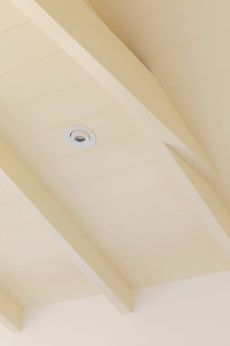
There are no prizes for guessing why this is ‘The Yellow Room’! That delicious custard colour is ‘Curd Half’ by Dulux, and we used it on the back wall, the daybed and the feature ceiling to bring all the warm cuddly vibes into this room.
One of the first features you notice in this room is the pitched ceiling, and it was one worth making a fuss of. We used Axon Cladding by James Hardie to accentuate it before painting it the feature colour. James Hardie is our go-to for cladding to create beautiful feature walls and ceilings and because it’s pre-primed and easy to install, our painters and builders love it too.
We can’t think of any girl who wouldn’t want her very own daybed in her room, and this curvy beauty makes good use of the corner space alongside the built-in desk. We’ve used the same Luxaflex Pirouette Shadings above the arched windows in this room.
THE BATHROOM
The girls’ shared bathroom sits between their two bedrooms. It’s big, beautiful and, according to Bonnie, has the ideal bathroom layout. The feature freestanding bath and custom vanity are the first things you see when entering the room. The toilet’s tucked away from view, and the rendered shower is bathed in natural light from the overhead skylight. Then there are the beautiful details like the glowing wall sconce, the curvy rendered ledge in the shower and of course the tiles.
On the floor, we laid the tiles in a playful checkerboard pattern by pairing the beige Seaforth travertine look tiles with the super cute Balmoral dusty pink tiles, both from TileCloud. For the vanity and bath wall, we chose a gorgeous Cremorne Calacatta marble look tile as a shiny glam contrast to the matt floor tiles and rendered shower walls.


