Q + A WITH LANA
We are LOVING the response to the Parents Retreat in #lanasforeverhome and have been inundated with messages and questions. We can’t always respond to everyone but we read every single comment and message and we really appreciate the support gang!
This week we are sharing the answers to some of our most asked questions with a one to one with our dream client 😲 Lana…
What was your inspo for your master bedroom?
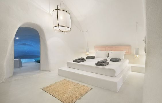
Like most of us I headed over to Pinterest, Google and Insta when I was looking for inspo. I found these shots which I thought really represented what I was looking for…
CLICK ON THE IMAGES TO BE TAKEN TO THE ORIGINAL SOURCE.
In the master, I wanted to create a really calming space but also one which works for our lifestyle. Jason and I have different sleeping patterns. He’s an early bird and I’m a night owl so it was important to create a space and layout which works for both of us. That’s why we have the ensuite and WIR separate from the bedroom so we don’t disturb each other with our different routines.
I also wanted to be able to control the light in our bedroom. We chose high windows to maintain some privacy and chose block-out window coverings that can be pulled down at the drop of a hat to make the room dark so I get some zzz's.
Picking white paint can be hard... what colour did you use?
Picking a white is actually much harder than people think! We always looks for whites which don’t throw yellow or blue. In this house we've used Dulux Lexicon Half Wash&Wear in Low Sheen for the walls. We also used the same colour for the ceiling. Lexicon Half was the perfect choice because it’s a cooler white so it works well with the warmer natural tones which Bon selected for the furnishings and the carpet.
Speaking of carpet… Love that plush looking carpet. What is it?
I wanted a premium, natural fibre, like wool, for my forever home. Something that would stand the test of time. But Bon got in my ear and warned me it could be too scratchy so I took my time testing out all the options. In the end I found this large loop pile from Feltex and it's honestly the nicest carpet I've ever walked on. It’s called Stonefields and the colour is Cotsworld Stone. I knew I wanted a light-coloured carpet which had a bit of warmth to it and the fact this looked a bit like sisal (but much softer) was a winner for me.
What's your fav feature of the master bedroom?
It’s really hard to pick you know… everyone always comments on how much they love the bed which is a simple design but also looks uber inviting. I found that king size gem at Gallery Homewares. I love the timber and how it matches so well with the print above it.
How much space are you going to let Jason have of the wardrobe?
He’s going to get 1/3… maybe ¼ 😊
Who did the cabinetry?
The wardrobes and vanity (and kitchen) were all done by Carerra by Design. Ronnie and co. are absolute legends. We’ve worked with these guys for a while now and we are just so thrilled with their work. Custom cabinetry really makes a big difference.
What was your inspo for the ensuite?
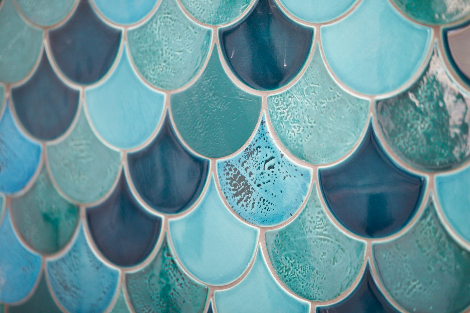
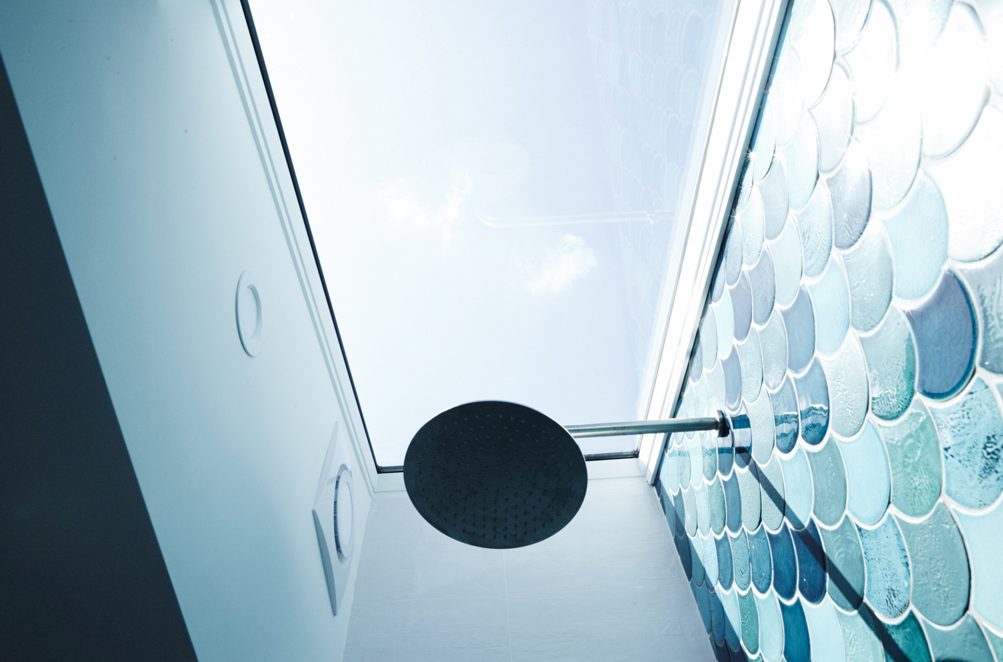
I became absolutely OBSESSED with these two shots which I found on Pinterest.
CLICK ON THE IMAGES TO BE TAKEN TO THE ORIGINAL SOURCE.
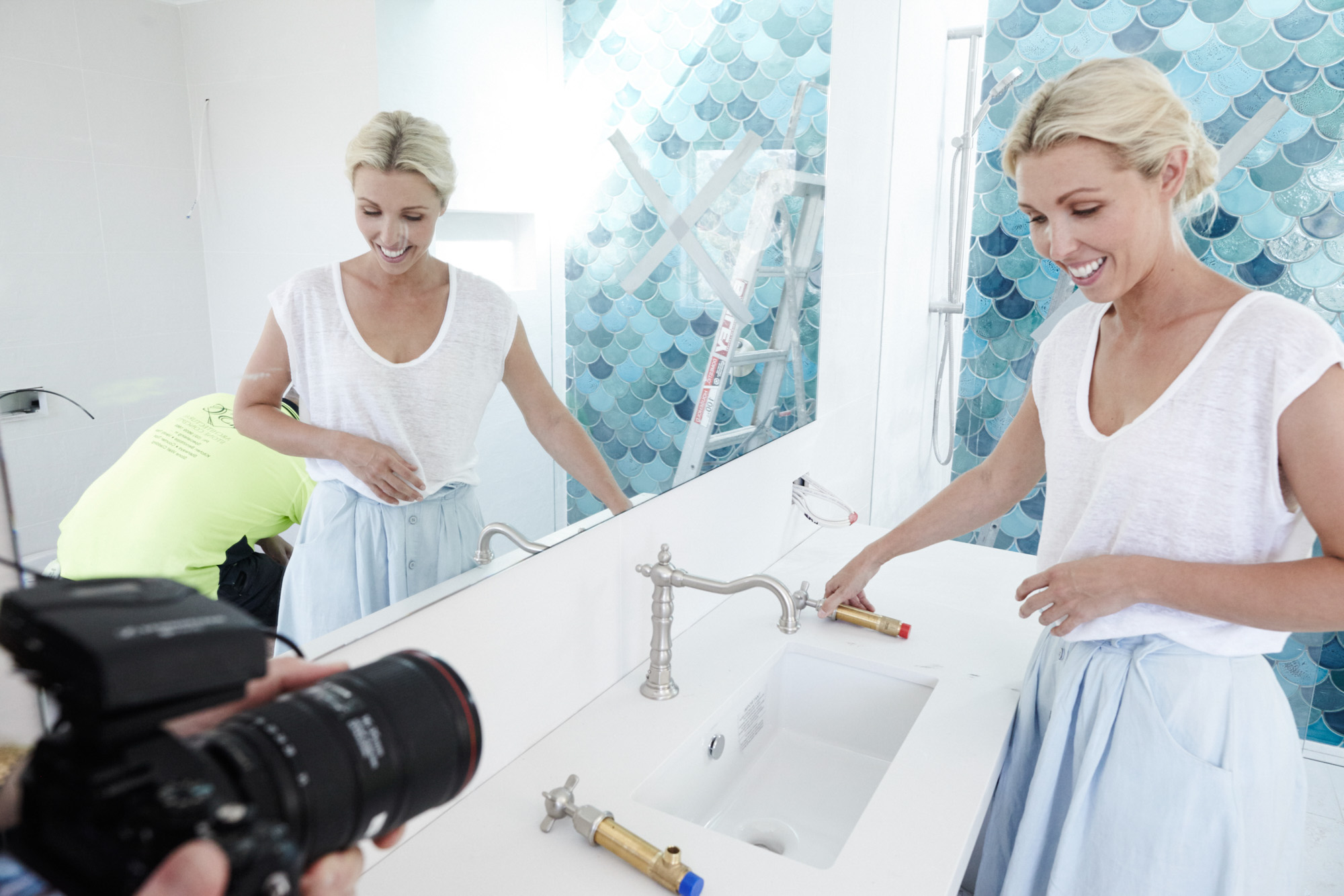
I loved the idea of installing a blue/green feature tile in the bathroom and loved the shape of fish scale tiles. I also knew it had to have a skylight over the shower after seeing that inspo pic from Pinterest. I wanted the feature wall to pop so I kept everything else quite muted but made sure there was some texture in the white tiles.
How did you source those fish scale tiles?
Cassie from my local Amber Tiles store in Chatswood was amazing. She helped me bring my vision to life. I went in nice and early in the process so they could help me find my dream tiles #cassiyourealegend
Why did you choose one sink instead of two for your ensuite vanity?
I know the normal thing would be to install two sinks but I felt bench space was more important than sink space. I didn’t have the luxury of endless space for the vanity so I decided to put in the Quinn 570 Under Counter Basin by Caroma which I felt was all we needed and it allowed us to have good space either side for Jason's makeup, ghd etc ;-)
What made you go for stainless steel rather than chrome?
I’ve always liked the look of stainless steel and for this bathroom I wanted a matte finish for everything which I felt worked well with the feature tiles. That’s why we picked the Caroma Titan range for the shower.


