A HOUSE IN THE HILLS TWO
"IT'S DONE. CONTRACT HAS BEEN SIGNED"
SAID JANE BOOTY OF CENTURY 21 CASTLE HILL.
This is all I heard as my iPhone slid off my lap and got stuck between my car seat and door whilst trying to navigate my Toyota into a tricky parking spot.
It didn’t matter. I had heard enough. Our second ‘House in the Hills’ renovation project had SOLD – 2 weeks prior to Auction - and for more than we’d hoped!
PAUSE + REWIND. LET ME TAKE YOU BACK TO 6 WEEKS EARLIER.
Some of you may remember our first House in the Hills reno. No? Take a quick squizz here to refresh your memories. Now with those images freshly burnt in your minds, can you imagine that our second House in the Hills could have been even more challenging than the first? No? #impossible
IT WAS! It was harder. Sure, this house wasn’t as dilapidated as the first... in fact it was perfectly liveable and even had a fairly new kitchen – but that was the challenge! How on earth were we going to radically transform this house to sell for a pretty profit in just 6 weeks!?
Well, I’ll get straight to the point (just how us mums like it). Here are the Top 3 changes we made to the house that added the most value:
1. OVERSIZED MASTER #biggerisbetter
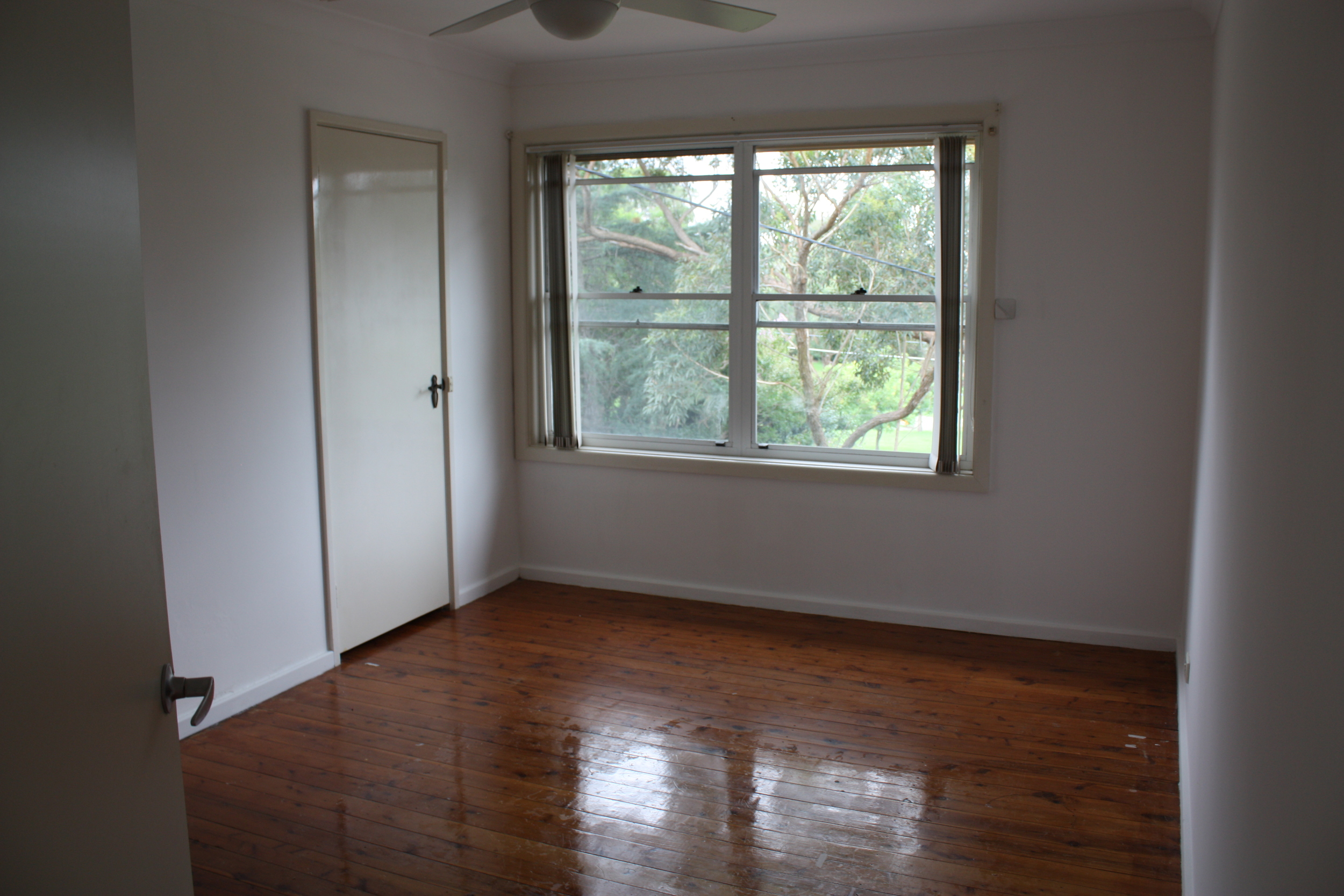
You’ve heard the saying “kitchens sell houses”. This is true. But in our experience, master bedrooms come a very close second. It makes sense doesn’t it? That’s the room your potential buyers will picture themselves waking up in every day so it really needs to blow their hair back #bringit. The original master in this house was too small, so we knocked down a wall and combined two bedrooms into one huge, oversized master suite with a luxurious, resort-feel. We also opened up the ensuite and integrated it into the room to make it feel even bigger. The trick was not to clutter up the room with ‘stuff’. Instead we aimed for a ‘beautifully uncomplicated’ look that soothed the soul.
2. ALFRESO LIVING #sydneyliving
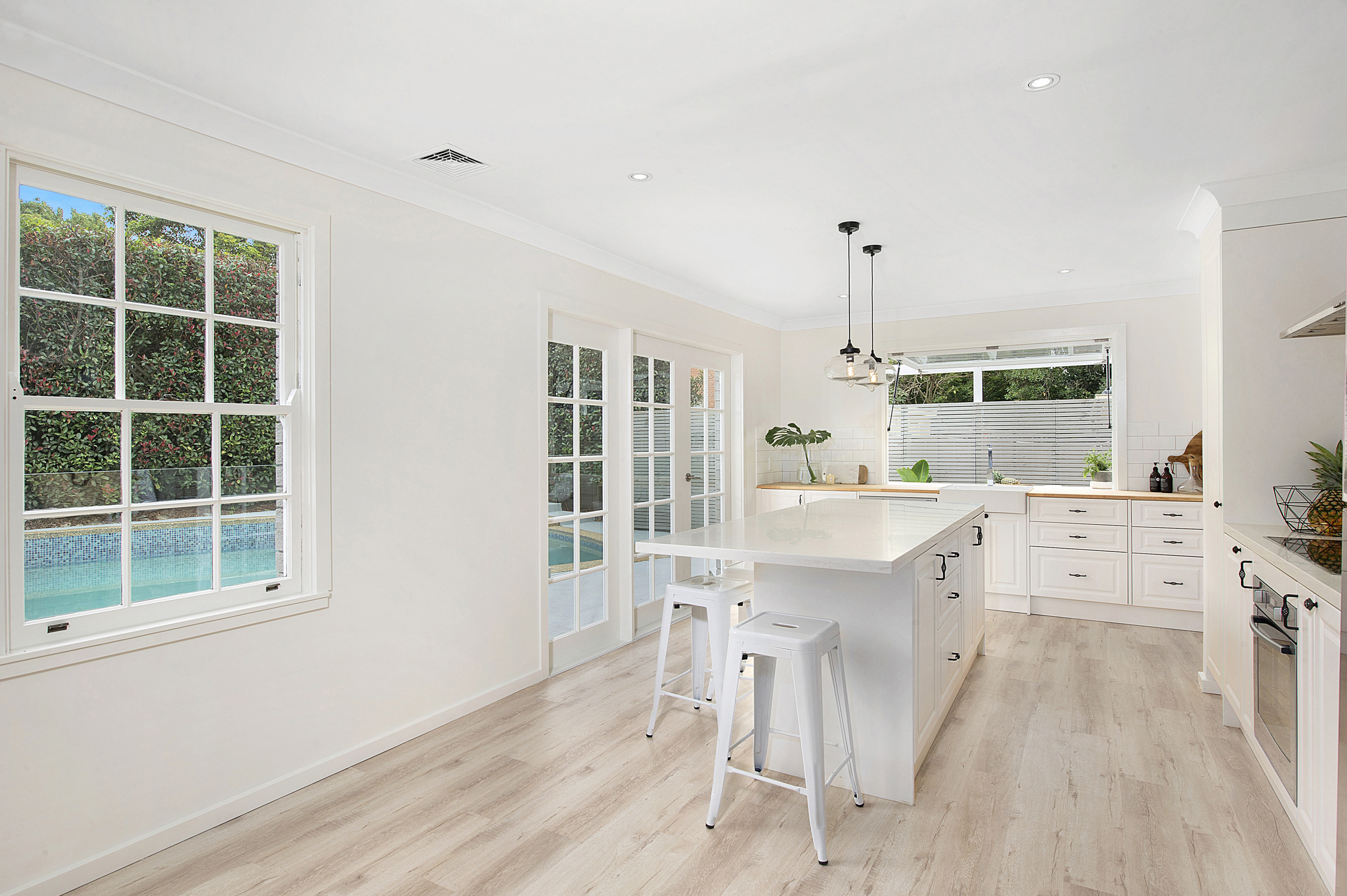
Who doesn’t love alfresco living!? With this house we tried to create a breezy, open-plan living style designed specifically for indoor/outdoor entertaining. We connected all the living spaces and removed several walls to open up a massive long room where we then moved the kitchen from the middle up to the far end. This made the kitchen a ‘destination’ rather than a ‘thoroughfare’ and enabled us to connect it directly with the new alfresco area via a bespoke breakfast bar and gas-strut window #trademark.
3. PAINT #nobrainer
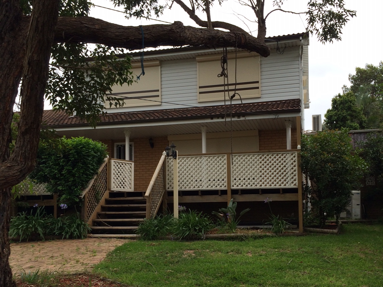
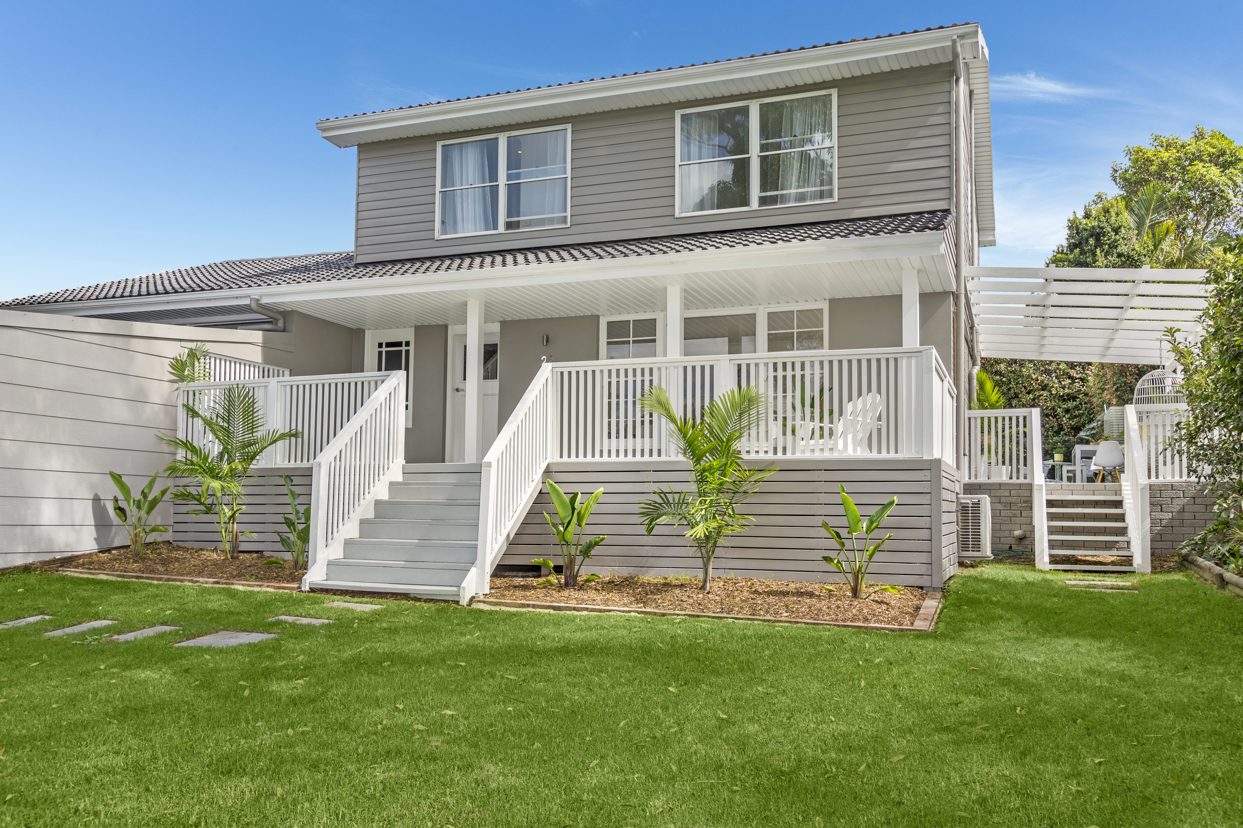
Everyone knows the power of paint but it still surprised us how effective it was in transforming this house. The exterior changed from looking blonde, beige (and bland) to grey, white (and gorgeous) in a matter of days. And the stairs were the same - one day they looked like a Swedish sauna from the Seventies, but just 48hrs later, they had been transformed into a fresh, white symbol of modernity contrasted against a sophisticated ‘Jack Black’ wall #onyataubmans.
Now I haven’t mentioned Styling (just because I promised to be punchy), but it must be said that Bonnie Hindmarsh, our Chief Designer, is the magician behind the fresh Hamptons look you see in the pictures. And if a picture tells a thousand words… I am well over my word count for today.
I promise to bring you our styling story another time. In the meantime, join our journey on Instagram @threebirdsrenovations xx
Originally posted on hillsdistrictmums.com.au


