HOW GREAT THOU ART
BY LANA
Artwork is such a personal choice. What floats one person’s boat isn’t always the next person’s cup of tea #whitewithoneplease. That said, I for one, love Bon’s choices of artwork in her Dream Home. True to her eclectic style she’s chosen different artists and a range styles but what they’ve all got in common is that they look amazing on those big white walls #bonniesdreamgallery.
Choosing art is really about what jumps out at you and what fits with your vision board. And it doesn’t have to break the bank! A couple of my fave prints in Bonnie’s home were under AUD$80. #winning #bonsbargains
Come for a private tour of Bon’s artwork, artist by artist
Simon Davidson
Bonneville Salt Flats #4
As seen in the Boys' Club Room
This print is an absolute #WHOPPER. It needs to be so it doesn’t get swamped by this big white wall and huge sofa. The Boys Club Room has got a boyish retro vibe to it so the vintage racing car is right at home, opposite the pinny machine. We first discovered Simon when we chose a black car doing a pink burn out for the River Shack.
Lauren Webster
Grey Rose Skateboard & Blue Belmont - Mixed Media Artwork
As seen in the Boys' Club Room
Another playroom wall, another retro car… are you getting Bon’s theme here? This print might look familiar. Good spotting! Bonnie used the green car from this Lauren Webster series in the River Shack reno.
What better way to inject ‘boyish cool’ into a room than with a skateboard on the wall. The Byron Bay collective Lark Skate Co shaped the board and the clever Lauren Webster painted it.
AND
Electric Confetti Neon
Boys Club (custom sign)
I didn’t know whether to include this awesome neon sign as art, but hey, I’m sure some aficionado once said “art is whatever you want it to be”, so that’s a good enough reason for me. It’s super-cute, it’s custom-made and it lets everyone know what to expect in this space!
Libby Watkins
Signature Ink Palm as seen in Dodge’s Bedroom +
Gypsy Palm in Original Blue as seen in the Casual Dining Room
Hailing from the Northern Beaches of Sydney, Libby’s love of all things botanical, including palms, made her works perfect for Bon’s #moderncoastalbarn. From the simple strokes of the palm in Dodge’s room to the intense colours on the hand painted canvas in the casual dining space, Libby’s got all things tropical covered in her works.
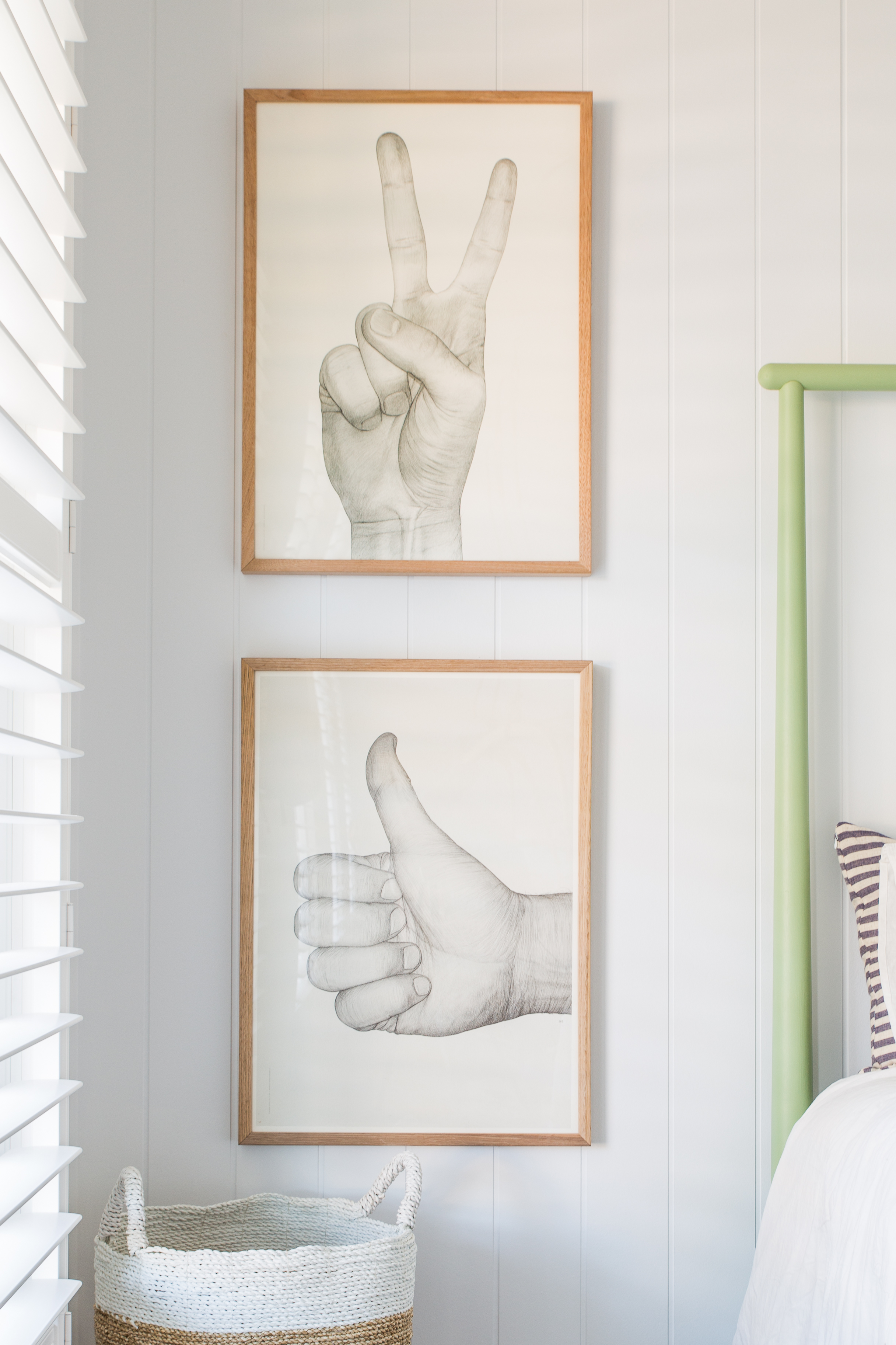
Börge Bredenbekk
V White Print (via Norsu)
As seen in the Twins’ Bedroom
Some people are waaaaay too talented. These hands are actually reproductions of original pencil drawings but the detail is next to none. And if the kids don’t appreciate the artist’s skill I’m sure they’ll be down with the gestures. When I saw how reasonably priced these were (only AUD$79) I nearly had an #artattack #dadjokes #sorrynotsorry. Such amazing value! Proof that art really doesn’t need to blow your budget.
Hugh Holland
Down on the Corner and Solo 1976
As seen in Archie’s Bedroom
I love how Bonnie brought the beach culture vibe to Archie’s room with these retro skater prints. The simple wooden framing and the fact that they’re different orientations add to the relaxed skater vibe.
Victoria Aguirre from We Are Pampa
Cross #4
As seen in the Main Lounge Room
I never expected this fabulous floral print to end up in Bon’s main lounge room. This room is serenity central with neutral everything, so this print really packs a punch. It’s bloomin’ beautiful!
Jai Vasicek
Lani Print in Pink
As seen in the Study & Bonnie’s Walk in Robe
The clever Jai Vasicek is one of our faves! Jai’s works appear in three rooms in Bon’s home and also our Three Birds HQ.
Nastia Cloutier-Ignatiev
Lollipop (via Nathan + Jac)
As seen in the Dining Room
This combo of modern print against traditional fireplace just rocks my world. It’s the perfect mix of new and old. And it goes to show that art doesn’t have to be massive to be impressive. All the negative, white space around it just accentuates the print even more #hotlipshoulihan
A La Mode Studio
Headdress Framed Canvas Print
As seen in The Cottage
How on earth do you choose artwork for an emerald green wall? I think Bon’s nailed it with this choice. The black elements means it complements rather than competes or contrasts with the wall colour. And the actual print, a lady in tribal headdress, is just stunning (especially up close).
Spanish Door Print (from OZ Design, artist UNknown)
As seen in the Adults Retreat
Palms in place of the TV? When they look this good why not? Would you ditch the TV for art?
So whaddya think? Which is your favourite piece? Tell us below.


