IT'S THE DETAILS THAT MAKE THE DESIGN
Erin loves to remind us that “the devil is in the detail” and that rings true for both planning and design of our projects. When planning and designing this new kitchen for our lovely family for four, we wanted to balance the practical elements with the pretty details to make sure they have a family kitchen they’ll love to live in. And it’s all the small details that combine to create the end result.
LOCATION, LOCATION, LOCATION
As is common with many old houses, the laundry had prime position at this place - on the entertaining deck with a view of the garden. Yes, it had great access to the outside for hanging the washing but with space at a premium, this just had to go.
We always say that renovating is about compromise. Whether you have a big house or a small house, a big budget or a small budget, one thing remains the same - you can’t have it all! In this house, we would have loved to recreate a separate laundry room with loads of space and a door to the outside but that would have taken away significant space from the kitchen (or somewhere else in the house that we deemed MORE important).
We pulled out our priority list and ‘large kitchen with plenty of room for our lovely ladies to cook together’ ranked WAY above ‘stand-alone laundry’. So, we agreed to lose the laundry and extend the kitchen to maximise the space.
THE LAYOUT
If the kitchen is the heart of the home, then the island bench is the heart beat of the kitchen. It’s the essential centrepiece that makes all the other parts tick.
We love a kitchen that opens to the outdoor entertaining space… but not when it’s at the expense of valuable seating space. So, we linked the indoors with the out by installing wall of sash slider windows which open to the deck and bi-fold windows with a built-in servery bench above the sink, with a view of the garden.
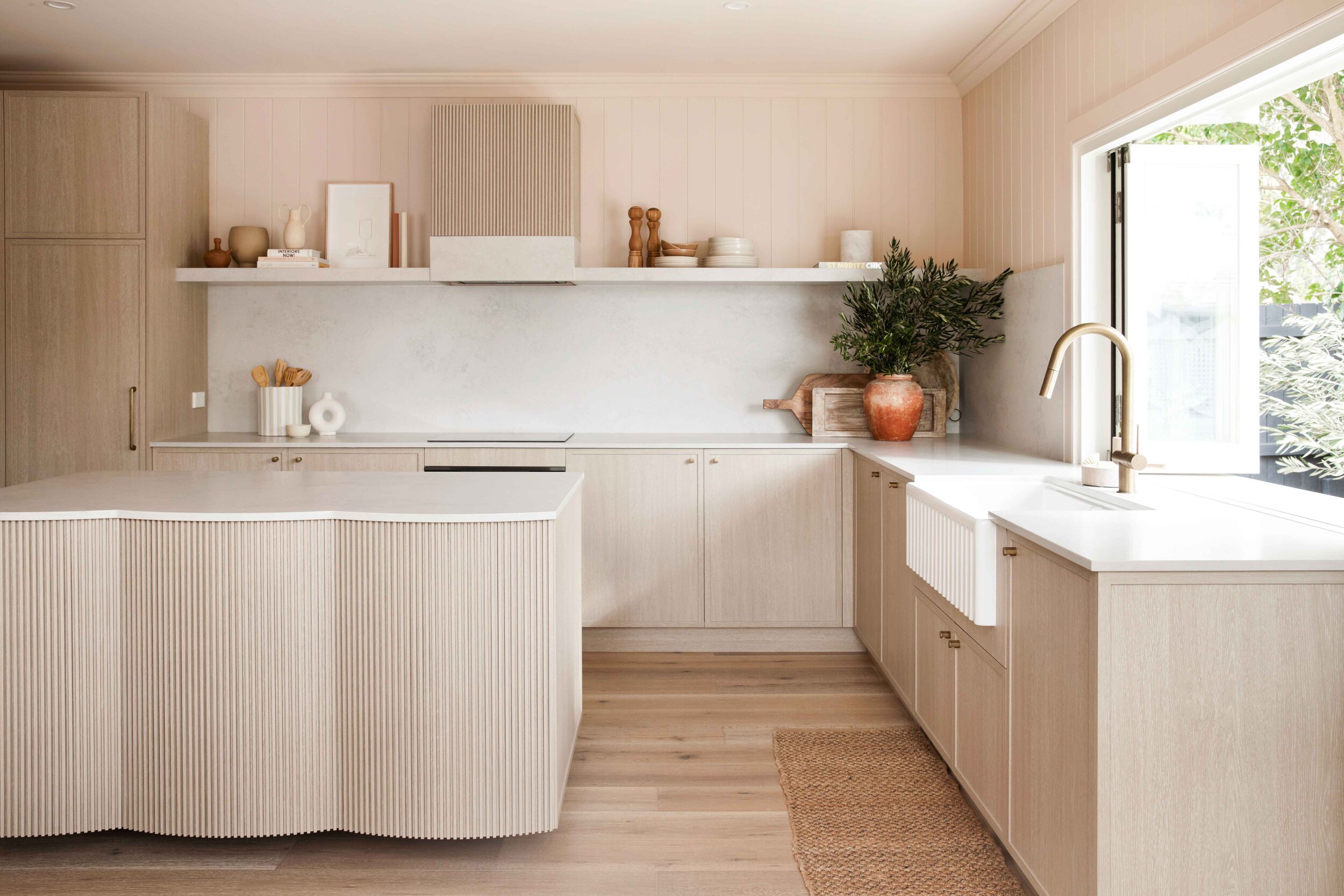
The cabinetry runs in a U-shape around the room and houses the essential kitchen appliances and a Euro laundry, hidden behind bi-fold doors.
CABINETRY, BENCH TOPS & FLOORING
Remember our vision board for this home? It’s all about warm, textured, natural tones and all of these needed to be included in our kitchen design too.
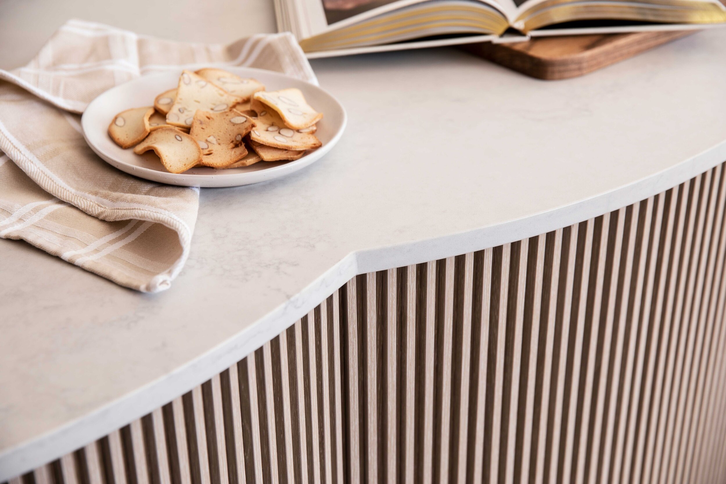
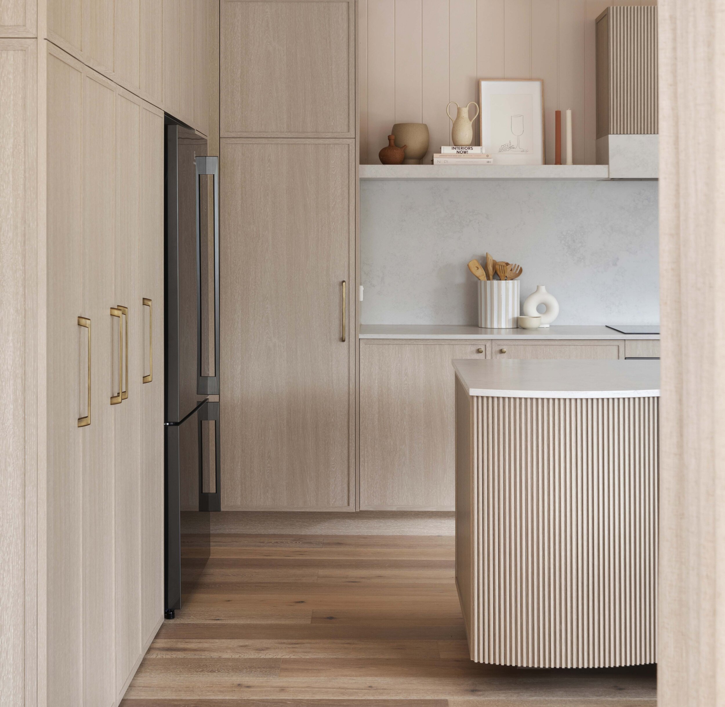
Bonnie and Ronnie (our cabinetry wizard from Carrera by Design) combined their creative powers to create a kitchen like we’ve never done before. They worked wonders to combine the warmth of timber with the timelessness of shaker profile cupboards with the contemporary statement of the curved island bench, complete with groove strip details. It’s more like a piece of designer furniture really! The large work space is unobscured by a sink or stools, to create a collaborative area for the ladies of house to cook together each evening.
Bon loves to get touchy feely with the materials we choose and can’t stop rubbing her face against the ‘leather honed’ finish of the kitchen bench tops. #weirdbuttrue We used the same Talostone Elba White for all the bench tops (20mm thickness), the splash back and also the built-in table tops alongside the bench seating. Engineered stone is always a winner in our eyes, both for its great looks and durability in a family home.
Look down and you’ll see our beloved Woodcut engineered timber flooring - no surprises here! This time in the understated ‘Smokey Grey’. It’s durable, easy to clean and feels amazing underfoot.
TAPWARE & SINK
Bonnie’s calling it her 'favourite sink yet’… and no one’s begging to differ! It’s a huge double-bowl fireclay butler’s sink and the farmhouse front grooves make it stand out from any sink we’ve used before.
The tapware, also from Reece, is custom coloured in ‘living tumbled brass’ which is designed to patina and age over time.
APPLIANCES
Ronnie worked his magic to fit the Electrolux fridge perfectly in place (because we all know Lana’s thoughts on ill-fitting fridges!) We chose the dark stainless steel finish to recess into the cabinetry and let the timber tones be the hero. It’s also mark-resistant so it’s forgiving to fingerprints.
Did you spot the integrated dishwasher? This one’s hidden in the cabinetry to the left of sink for easy loading. This is the fourth house that we’ve used this Electrolux dishwasher in, because it’s so clever. The door pops open a few centimetres at the end of the cycle for maximum drying performance and it’s 25% bigger than your average dishwasher, which is always a good thing for a family kitchen.
And that’s not the only clever appliance in this kitchen - the integrated rangehood turns itself on when you start using the induction cooktop and intuitively adjusts the fan speed to suit while you’re cooking. #cleverclogs
SEATING
The dining table is within a stone’s throw of the kitchen for meals so, we prioritised bench seating to create a “drink in” rather than “eat in” kitchen.
Y’all know how much we dig a bench seat, and these are the fanciest ones we’ve created yet! They’re built to Lana’s ideal specs #benchseataficionado #selfappointed - 450mm high (before the cushion) x 510mm deep. To make them extra spesh we ran Axon cladding around the base, finished off with Intrim skirting and painted Dulux ‘Clay Pipe’. Sitting pretty on top, the custom cushions were made for us by The Foam Booth using gorgeous textured fabric from Florence Broadhurst. Check out the arch shape of those back cushions, centred under the windows… we just can’t get enough!
In a Three Birds first, we added two little coffee tables built in to the bench seats, just the perfect size to rest your drink of choice. #bottomsdown #bottomsup
STYLING
Floating shelves are a gorgeous way to inject some personality into your kitchen, rather than wall-to-wall cupboards. They’re great to display your favourite cook books (and by favourite we mean best-looking! Not the ones with the pasta sauce splats and dog ears - ok?), some beautiful crockery or a vase of fresh flowers - all while keeping your bench space clear and tidy.
Some of our other styling faves are wooden cheeseboards (great for hiding power points!), assorted wooden utensils in a ceramic jar and a big bunch of greenery in a vase or urn.
EURO LAUNDRY
When you can’t have it all, a Euro laundry is the perfect solution for a fully functional laundry without the compromise of the space that a standalone laundry requires. And with your laundry this conveniently located, you’ll be on top of your washing faster than you can say ‘whose sock is this?’
To create a seamless look between kitchen and laundry we hid the laundry behind bi-fold doors and continued the same tapware and stone into this space.
Do you want more detail on the details? You’re in luck! We list all the products we use in our projects on our Get the Look pages. Happy shopping! x


