SMALL SPACE DESIGN
THE COTTAGE REVEALED - BON TELLS ALL!
BY LANA
Gorgeous peeps, we’re still buzzing from your overwhelming response to the first big reveal of Bonnie’s dream home! #allthefeels
How AMAZING is her Granny Flat… more aptly renamed the ‘Guest Cottage’? Who wants to move on in? It may be small on space, but it’s seriously big on style.
I asked Bonnie to fill us in on all the deets...
Tell us about the bathroom – it’s so tall you could bath a baby giraffe in it:
Yep, it’s definitely tall and skinny! Space wasn’t on my side when I designed the bathroom. But I love a challenge and the outcome is perfect. In a small room you really need to embrace space where you can get it, so going vertical and pushing the ceiling height to the max can give the impression of size. A skylight floods the room with light and adds wow-factor.
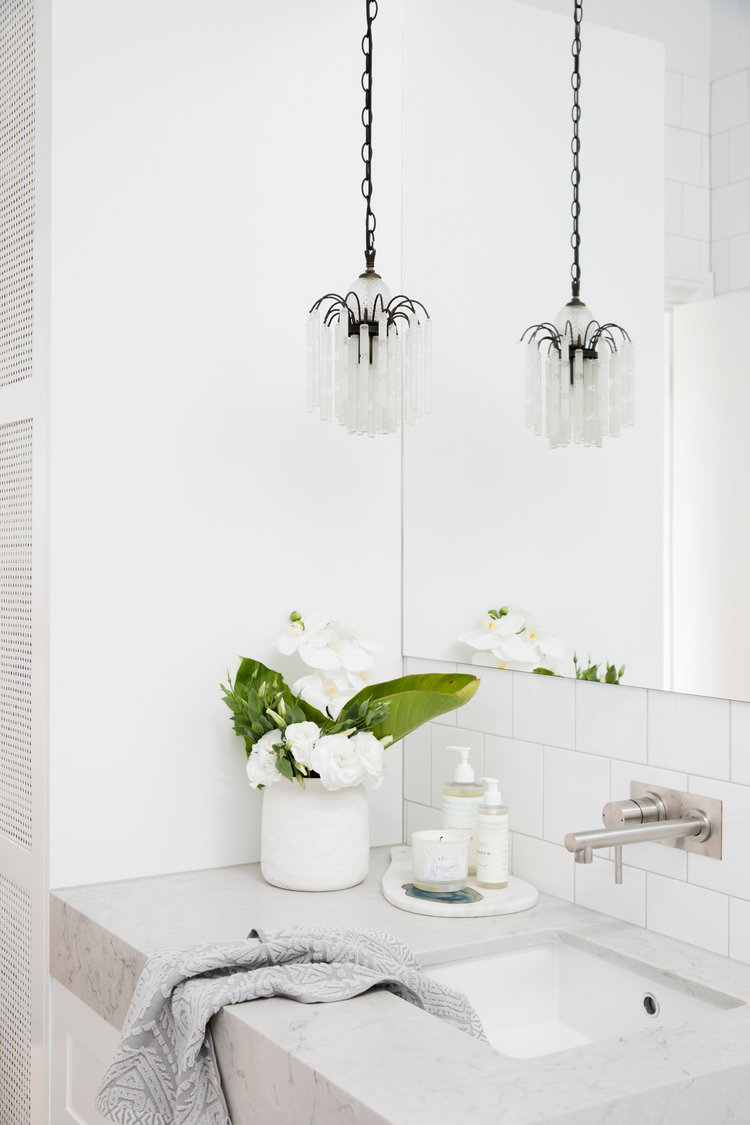
You might think you have to leave a bath out of a small bathroom design, but my little bubba loves a bath and I didn’t want to compromise, so the 1400mm Caroma Liano bath meant I didn't have to compromise. The room is so skinny that the bath takes up the entire width of the bathroom and creates a wet area with the shower. It’s heavenly standing under the rain shower and looking up through the skylight. And we chose the most streamlined toilet possible, the Caroma Invisi, tucking it away next to the vanity.
What other small space design tips did you use?
In a small space practicality and functionality are essential, so to save space in the kitchen we (thanks Erin!) managed to squeeze the laundry into the bathroom as well. This is a top tip for saving space in any reno. I’m loving the shelf in-between the vertically stacked washer and dryer to store the washing powder (and odd socks) and best of all it’s all hidden behind a door.
In the kitchen I went for white appliances to elongate the cabinetry, it looks longer and sleeker when everything’s the same colour. And added the rattan inserts to the shaker style cabinets to add to the cottagey feel. Ronnie from Carrera by Design totally nailed those doors.
And the bedroom… which also has cladding, do you think you used enough cladding?!
There’s no such thing as too much cladding! James Hardie cladding gives you texture and detail within a small space. In the bedroom we didn’t even need a headboard behind the bed thanks to the detail of the cladding - another space saver!
I’m totally crushing over the green velvet bench from Zanui. You don’t want too much furniture to clutter a small space, but a stunning statement piece like this adds colour and practicality.
" I’m so happy with how The Cottage turned out. We crammed so many good things into this small package! "


