OUT OF THE MOUTH OF A STYLING SCHOOL BABE
Late one night when we were scrolling our Instagram feed…sound familiar?…we stumbled on some pics from Three Birds Styling School, accompanied by the gorgeous words of a Styling School student and self-proclaimed vision board junkie, Jodie Pantaleo.
Heck, we didn’t even have to ask/bribe/blackmail Jodie to write this review, there it was, in her own words: “When the fabulous @threebirdsrenovations released their new online education course back in December, I jumped at the chance to devour their brilliance!”
So, we slid into her DMs and asked for permission to share her words directly with you.
Here are my TOP 5 takeaways from Styling School
(Save for later 📌)
1. Vision boards are EVERYTHING!!
The main purpose of a vision board is to capture the essence and overall vibe. Not just how you want a space to look...but more importantly, how you want it to feel. Don’t even think about tackling an interiors project without one, it’s non-negotiable 🤨
Note from Three Birds: Correct - go straight to the head of the class!!!
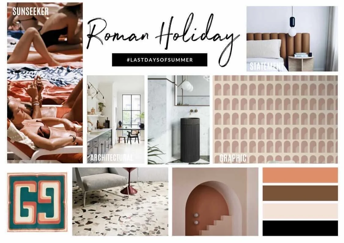
Jodie put her skills to work on a range of styles.
2. Pinterest
The holy grail of image sharing, discovering and saving. It only has about 320 million monthly users...no biggie. Create a Pinterest board for every single room in your home...including outdoors...and start pinning your little heart out. Personally, I try to jump on daily to add (and cull) my boards. And trust me, the culling part is even more important when the vision is getting hectic!
Also, a little hack I like to use…screenshot saved images from Instagram and add them to your Pinterest board...straight from your phone! If you haven’t already got a Pinterest account… don’t wait! Just be prepared to lose a few hours down the inspo rabbit hole. 🥺
3. Key styling principles
For great design incorporate scale, balance, harmony, rhythm and contrast. Nail that orchestra and your home will literally SING. 🎶
4. The 60:30:10 colour rule
60% is the most dominant and usually takes up the biggest surface area e.g floor colour, walls (usually a neutral) 30% incorporates 2-3 supporting colours on your vision board and 10% tie in the accent colours to inject extra spark & personality. 🎨
5. Art
Colour is king when it comes to selecting artwork, as it sets the benchmark for the entire colour scheme. The secret sauce is in the tones and nuances within the artwork...and how you seamlessly weave those features in a complementary or contrasting way within the space. 🖼
Since I made these boards (and went through the Styling School process) I’ve decided on a new direction for my forever home - it’s Roman influenced...mixing bold patterns classic architectural influences. I’m obsessed!
These takeaways really just scrape the surface - I got SO much value from the course.
5 stars, highly recommend!
Get the yin and yang of these design elements right… and you’re well on your way to unleashing your “inner styling rockstar!”🤘
– Jodie
You can follow Jodie @style__republic
Do you want to join Jodie and thousands of other students from all around the world in our online Styling School? Our next take starts soon!


