BOYS' BEDROOMS BONANZA
BY BONNIE
Lots of boys means lots of bedrooms! And for some reason I found them the toughest rooms in my dream home to design. I think it’s constantly having to think forward, to picture your kids a few years from now and imagine what they’ll need in a bedroom then. Not just what looks good now.
My top tip for designing kids’ bedrooms is to create something that’s as perfect now as it will be in five years’ time. You want to create a room for them to grow into, not out of! It’ll save you both time and money #thankmelater ;-)
In my case, four growing boys meant four boys bedrooms to design. Well, that’s what I thought, but they had other ideas…
THE TWEENAGER
My big boy Archie is 12 and has just started high school. His room’s in a darker corner of the house so I added a skylight which filters beautiful light into the room. He’s my biggest boy but I still wanted to include some playful touches. Like the climbing wall which goes up into the skylight vault… he might be at the top in four steps, but how good does it look?! The gymnastics hand rings also add boyish charm to the room.
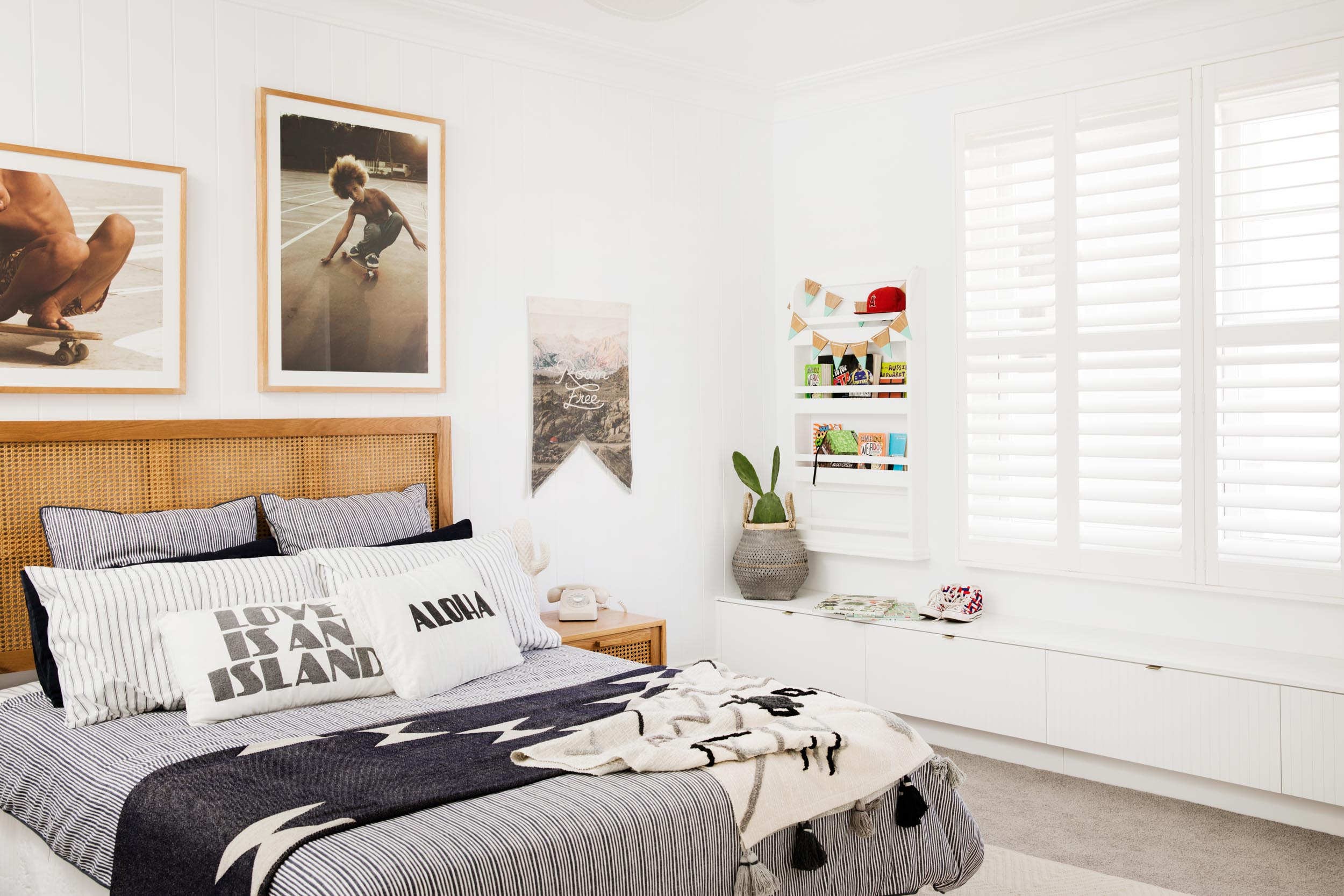
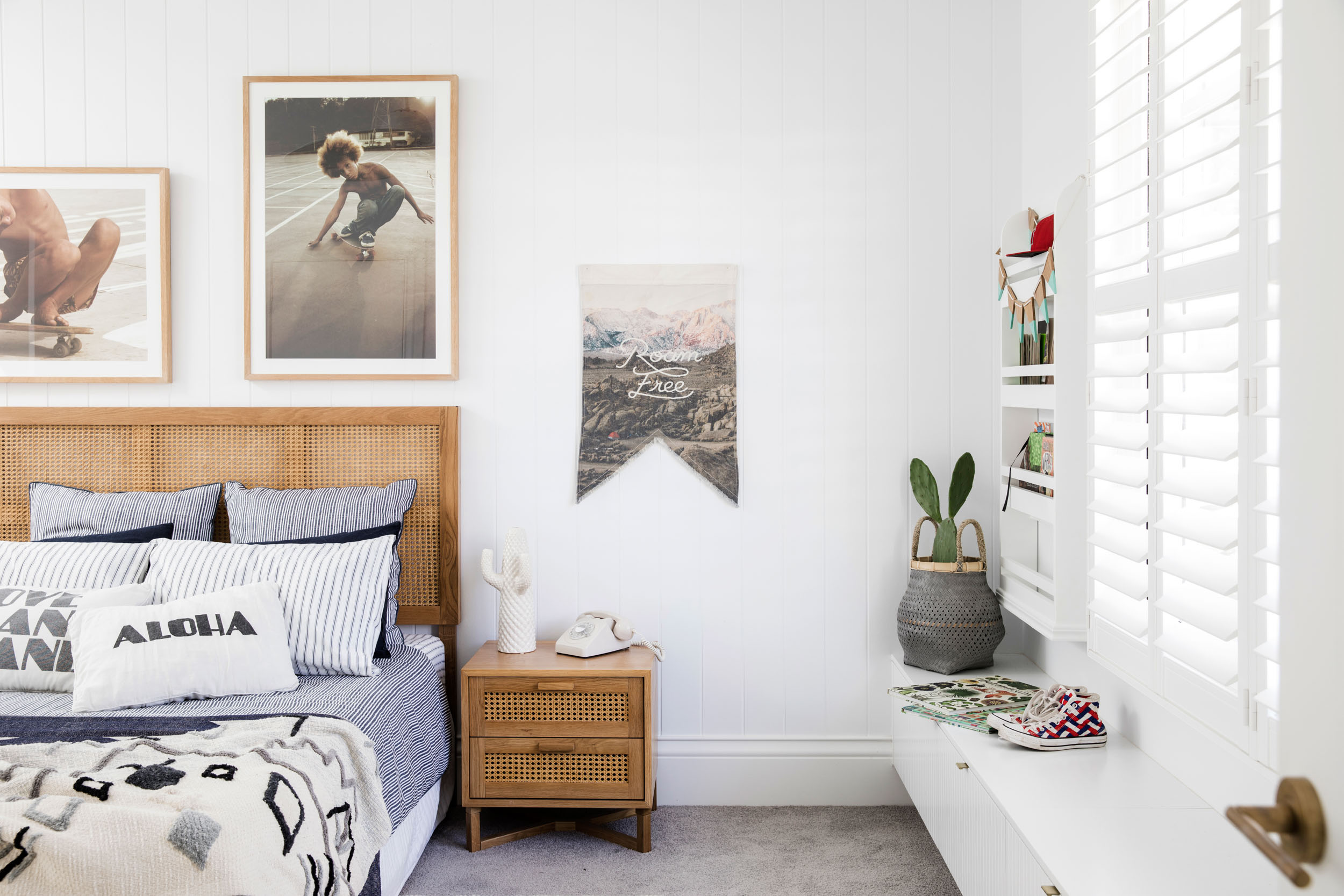
Behind the bed, no surprises here, I’ve used my fave James Hardie Axon™ panels to add texture to the room. This works perfectly with the amazing rattan headboard and side table from Freedom. Freedom’s smashing it this season, they’ve got an awesome selection of kids’ bed linen too. I’ve layered patterns and textures for a masculine look without a fire truck or footy poster in sight!
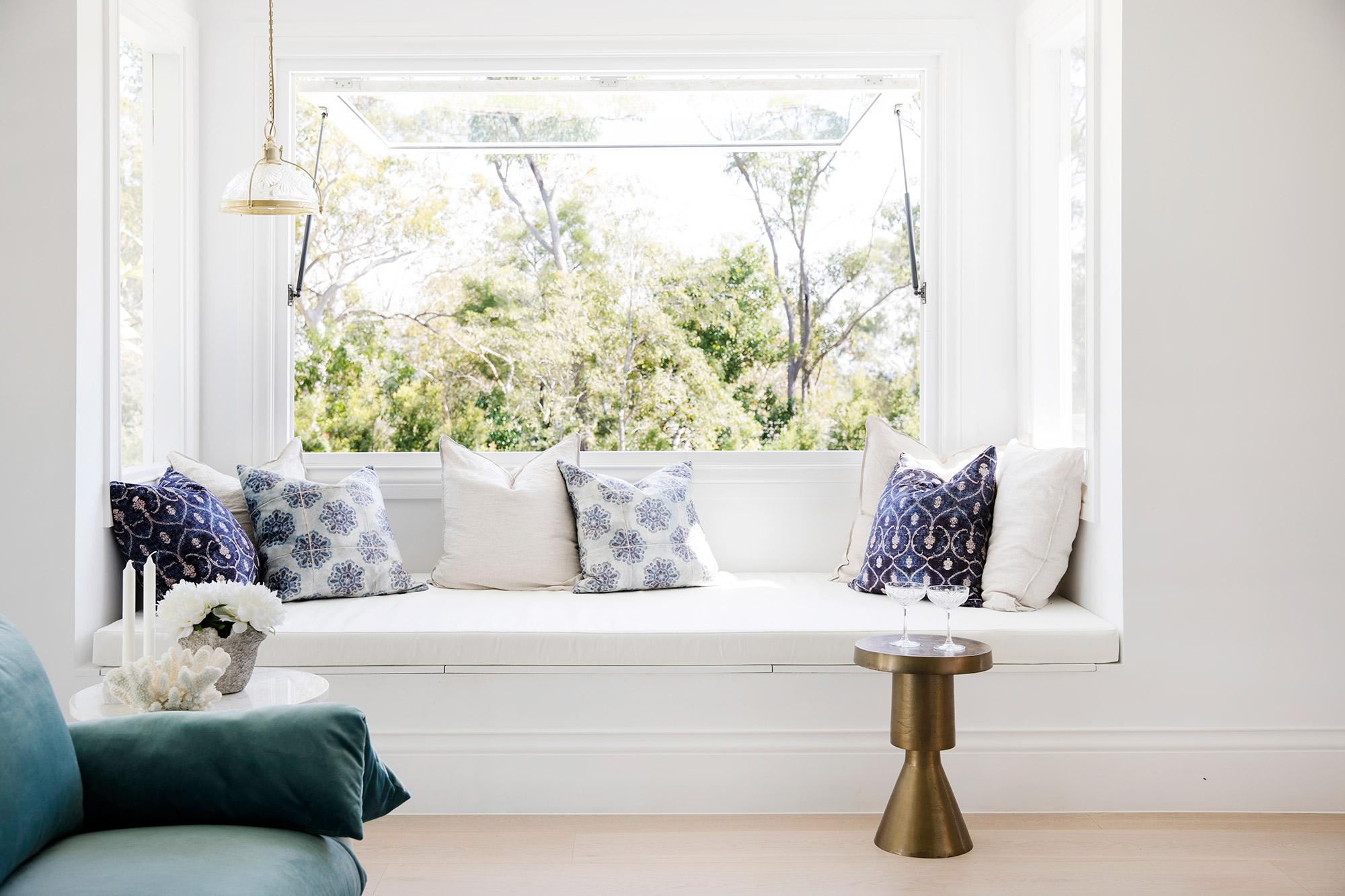
Practical additions like the window bench seat with built-in storage and the wall-mounted bookshelves will help keep his room tidy #icanonlydream
THE TODDLER
Little Dodge, aka Dodgeball, is two years old, but will always be my baby. But I had to put my baby thoughts aside to create him a room that’s as practical for him now as it will be in a few years. So forget the cutesy babyish styling!
Keeping with the coastal vibe of the house, I chose a gorgeous palm print wallpaper for the feature wall behind the bed. The subtle greens set the colour tone for the room and look gorgeous with the natural wood furniture. See, I don’t ALWAYS pick white!
The super cute bunk bed is used more as a climbing frame at the moment, but the top bunk gives the option of a little friend (or big brother!) sleeping over in years to come.
THE TWINS
Ten-year-old Buster & nine-year-old Rowdie are only 16 months apart #whatwerewethinking so we call them “the twins”. They’re as thick as thieves and they threw a bit of a spanner in the works when I showed them the floorplan of their new, separate bedrooms. They had no plans of ever not sleeping in the same bed, let alone not the same bedroom!
I really wanted to keep the physical space of each of their bedrooms because surely, they’ll want their own privacy one day #hellofirstgirlfriend #omg. In the meantime, the simple solution was to get rid of the wall down the middle. Lucky my fab builders are used to me making changes on the fly and this was an easy peasy one.
Each end of this huge double bedroom is pretty much a mirror image of the other. They’ve each got a double bed to grow into (if I can ever get them out of the same bed!) #onelesstomake
So instead of boys’ bedrooms #3 and #4, we’ve just got 3! I wonder how many years we’ve got until the builders are back for #4?


