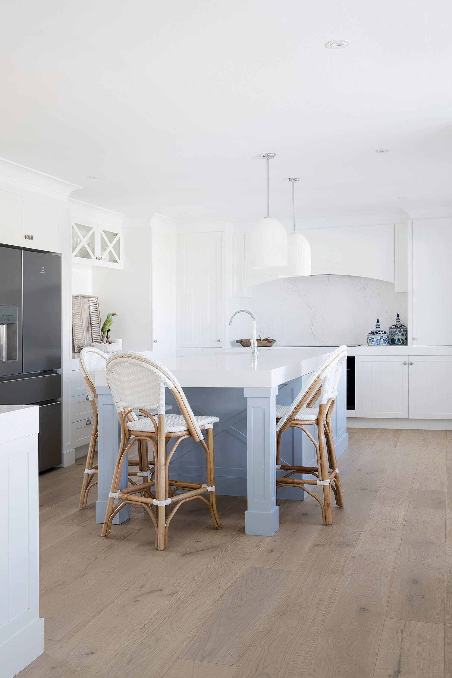
THE ULTIMATE GUIDE TO DULUX 'WHITE ON WHITE'
If your dream home shouts light, bright, and forever fresh, then white paint is probably at the top of your wish list. It's the ultimate go-to when you're giving those tired walls a makeover – and let's be real, a few coats of crisp white can work miracles! There’s nothing quite like the magic of paint to breathe new life into any space.
But not all whites are created equal. In this blog, we’re shining a spotlight on one of our all-time favourites: Dulux White on White. So, if you've been busy googling 'White on White', 'Vivid White', 'white paints', or 'the perfect shade for my project'... you're in the right place!
White on White in Three Birds' House 8
White on White has become a go-to for many interior transformations in our Three Birds Renovations homes, especially when we're choosing the perfect white paint to achieve our signature coastal cool style.
Let’s break down everything you need to know about Dulux White on White, from its undertones and characteristics to how we’ve used it in our projects and why it could be the perfect fit for your next paint project too.
THE LOWDOWN ON ‘WHITE ON WHITE’
White on White is a stunning cool white, characterised by its slightly blue undertone. This subtle undertone gives it a crisp, fresh appearance. The cool undertones help balance out the brightness of natural light, making it perfect for bright spaces in contemporary homes.
One of the things we love about White on White is its versatility. It works beautifully in homes with plenty of natural light, where the undertone helps keep the white feeling bright and sharp, rather than harsh or clinical. On the flip side, in rooms with less light, White on White can bring a sense of spaciousness, enhancing the room’s overall brightness.
‘WHITE ON WHITE’: NEED TO KNOW BASIS
 Undertone:
Cool with a hint of blue.
 Finish:
Crisp, modern and clean.
 Best suited for:
Coastal, contemporary and minimalist interiors.
 Natural light:
Reflects beautifully, amplifying the sense of space.
WHERE ‘WHITE ON WHITE’ SHINES
White on White is a fantastic choice for modern, coastal and minimalist interiors. Don't look past sampling this shade if you’re going for one of these styles:
1. Modern Minimalist
For lovers of clean lines and uncluttered spaces, White on White is a dream come true. Its crisp minimalist white finish complements the minimalist aesthetic, where simplicity is key. Pair it with sleek furniture, glass, metal accents and neutral textiles to create a space that feels calm and organised.
2. Coastal Chic
If you’re after that light, breezy coastal vibe we love, look no further. White on White is often used in coastal homes because it reflects the natural light, giving rooms that fresh, seaside airiness. Think light oak-engineered timber flooring, textured linen furnishings and rattan rugs to really bring this look to life.
3. Scandinavian
White on White fits perfectly into a Scandinavian-inspired home, where light is a priority and the palette leans towards whites, greys and soft neutrals. White on White adds just the right amount of contrast, making it an ideal base for homes with light wooden furniture and soft, textured accents.
4. Open-Plan Living
Because of its ability to bounce light around, White on White works wonders in open-plan spaces. It helps create a seamless, continuous flow from room to room, making the space feel even larger and more connected. Use it for walls, ceilings and trims to maintain that cohesive, expansive look throughout your home.
How We’ve WORKED OUR MAGIC WITH Dulux ‘White on White’
At Three Birds Renovations, we’ve fallen in love with White on White and it has knocked other popular Dulux paint colours like Dulux Vivid White, Dulux Casper White Quarter, and Dulux Snowy Mountains Half out of the running in several of our design projects.
Let’s take a closer look at why we chose White on White for some of our favourite spaces.
House 8: Coastal Dream Home
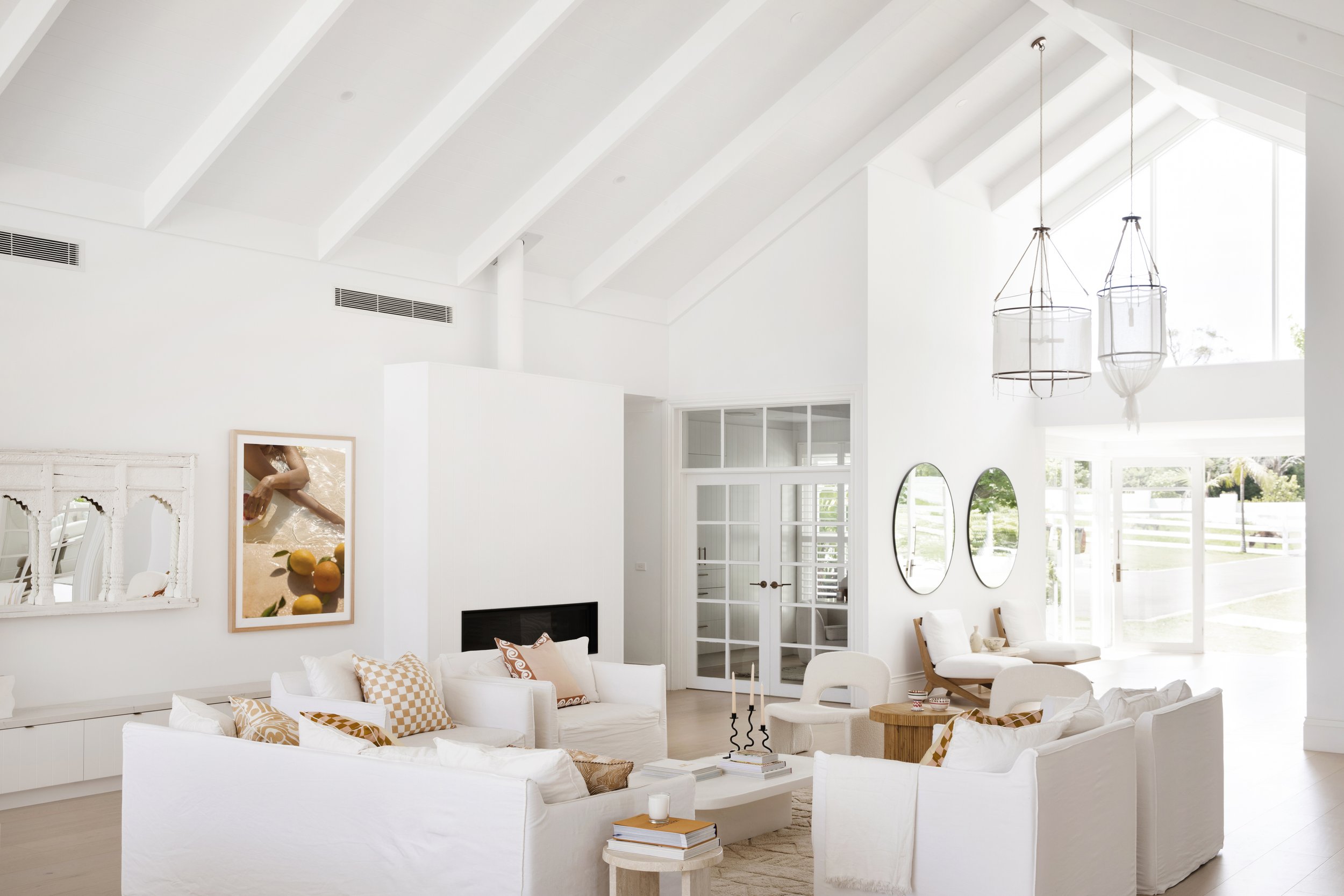
We needed a colour for this coastal-inspired home that would bring the light and breezy feel of seaside living to a house located nowhere near the coast. White on White was the ideal white paint colour to achieve that open, light-filled look. Its cool undertones worked beautifully to enhance the light flooding into the home, while its crisp, clean finish gave every room that signature coastal freshness we were after.
Why did we choose White on White? It's the ideal backdrop for creating that relaxed, coastal vibe and it pairs perfectly with the Woodcut engineered timber flooring we’ve used throughout.
Three Birds Renovations House 8 - The Front Entry & Lounge
House 9: The Bold Extension
At House 9, we used Dulux White on White throughout the entire home to achieve a fresh finish that flows seamlessly from room to room. We transformed the old, dark cottage into a light and bright family home, using White on White across the walls, ceilings, and cabinetry, with pops of bold colour throughout.
By using this shade consistently, we created a sense of continuity that allowed the open-plan kitchen, dining, and living areas to blend effortlessly. It reflects the light beautifully, making the living areas feel more expansive and airy. This neutral base also gave us the freedom to introduce bold black fixtures, black accents on the doors and glass display cabinet and the statement green island bench, creating a striking contrast.
House 9 - Kitchen & Sitting Room
House 10: Hinterland Hideaway
Tucked away in the Byron Shire Hinterland, House 10 is a beautiful Mediterranean-style home, and Dulux White on White was just the right shade for the interior. This property, surrounded by lush bushland, can be quite shady, so we wanted the interior to feel bright and open. White on White's ability to reflect light helped amplify that sense of space. The cool undertones allowed us to create a crisp, contemporary feel throughout the home, which pairs beautifully with the light and expansive windows we incorporated into the design.
Dulux White on White was the perfect choice for a light and bright interior at House 10
Its neutral, minimalist vibe perfectly complements the natural elements like timber, rattan, and soft textiles, giving the home a warm, welcoming atmosphere without overpowering the design.
House 11: Colour Me Hamptons
When you're onto a good thing, stick with it, right? We wanted this Hamptons-inspired beauty to feel spacious, fresh, and full of light – and Dulux White on White delivered just that!
The formal lounge at House 11
This crisp shade brought the perfect balance of brightness and elegance, giving the interior walls a clean, airy feel while making the whole space look larger and more open. We layered in natural textures, pops of colours and soft furnishings, and White on White provided the ideal neutral canvas to let those elements shine. The result? A timeless and sophisticated look that’ll never go out of style.
FEELING BLUE?
People often tell us that they’ve chosen White on White for their paint project because they’ve seen it and loved it in our houses, but shock horror, it looks BLUE in their home! Chances are, it’s because they’ve painted it next to another white (often Ceiling White) with a different undertone, which makes the blue undertone in White on White stand out.
This is why we recommend tinting all your paint to the same shade - whether it’s the Ceiling White, semi-gloss for trims, or flat. Not only does this simplify your paint choices, but it also prevents contrasting whites from clashing with different undertones. This is often why people end up feeling like their white walls have a blue (or green) hue.
Why We’RE CRUSHING ON Dulux ‘White on White’
After using Dulux White on White in numerous projects, we’ve come to appreciate why this shade is such a popular choice for so many home renovators. Here are a few key reasons we keep coming back to the same colour:
1. Crisp, Clean Finish
The cool undertones of White on White deliver a crisp, fresh finish that gives any room a contemporary edge. It will still appear crisp white on your walls, but if you're comparing it to Vivid White or Ceiling White, it may look blueish, especially in low-lit areas. Whether you’re working on a modern kitchen or a coastal-inspired living room, White on White provides that bright, clean base we need to build the rest of the design around.
2. Perfect for Natural Light
One of the biggest advantages of using Dulux White on White is its ability to bounce light around the room, making spaces feel more open and airy. In homes where light is a key feature, this shade helps amplify that brightness and adds a sense of spaciousness that’s hard to achieve with warmer whites.
3. Versatile for Multiple Styles
Whether it’s a minimalist living room, a Scandi-inspired home office, or a coastal retreat, White on White fits into a wide range of interior styles. Its cool undertones allow it to pair beautifully with different materials, colours, and decor styles, making it a versatile choice for any room.
4. Timeless Appeal
While trends in paint colours come and go, Dulux White on White has a timeless appeal that makes it a great long-term investment for your home. It’s modern yet classic, ensuring that your space will look fresh and current for years to come.
‘White on White’ Watchouts
When using Dulux White on White, it’s important to keep a few key "watchouts" in mind to ensure the colour works harmoniously with your space:
1. Cool Undertones
While the cool blue undertones in White on White give it a fresh, modern feel, they can sometimes come across as too cold in rooms with limited light or in spaces that lean toward a darker, moody atmosphere. To avoid a sterile look, balance it with warmer furnishings and natural materials like timber or soft textiles.
2. Natural Light Impact
White on White thrives in spaces flooded with natural light, reflecting brightness and amplifying the sense of space. However, in rooms with minimal light, it may enhance shadows and make the space feel a little stark. Test the paint in various lighting conditions before committing to ensure it complements your room’s natural lighting.
3. Contrast with Warm Tones
If your home features a lot of warm or earthy tones (like beige, terracotta, or rich wood), White on White’s coolness might clash. To maintain a cohesive feel, consider balancing the colour with cool-toned accents or limiting its use to areas where you want a distinctly modern, crisp look.
4. Furniture and HOMEWARES Pairings
Because of its sharp, clean appearance, White on White may feel too harsh when paired with overly dark or very warm decor. If your furniture and decor lean warm or traditional, consider adding soft textures, neutral accents, or even layering in warm lighting to balance the overall look.
5. Testing is Key
Like all paint colours, White on White can look different depending on the lighting, flooring, and even the time of day. Always test a sample on your walls in different rooms to see how it reacts with your interior elements, ensuring it creates the effect you’re after.
By keeping these watchouts in mind, you can make the most of White on White’s fresh, clean look while avoiding any potential pitfalls.
🌶️ TIP: When it comes to selecting white paint for interior walls, our number one recommendation is to have all your paint tinted to the same shade of white. That’s right, every bit of it. So, if you’re using White on White for a room, we’ll make sure the walls, trims, doors, and even the ceiling white are tinted to the same colour.
Why Choose ‘White on White’ for Your Next Paint Project?
If you’re looking for an alternative to Dulux Vivid White that offers a fresh, contemporary feel, Dulux White on White might just be the perfect choice for your next renovation. Its crisp finish, ability to reflect light, and versatility across different design styles make it a standout option for anyone wanting to create a bright, modern, and timeless home.
The most popular Dulux Whites
Dulux's most popular whites are some of Australia’s most loved colour choices - and at Three Birds Renovations, they’re some of our favourites too! The right white can easily transform any space, whether you’re after a clean and crisp look or a warm and inviting feel.
House 6 - Lexicon Half
House 10 - Casper White Quarter
Bonnie's Brother's Cottage - Whisper White
If you're shopping for white paint, be sure to grab some sample pots of these Dulux whites from your local hardware store:
Most Loved Cool White Paint Colours
Dulux Lexicon Quarter ®
Dulux Lexicon Half ®
Dulux Vivid White™
Most Loved Neutral White Paint Colours
Dulux Natural White™
Dulux Snowy Mountains Half
Dulux Casper White Quarter
Most Loved Warm White Paint Colours
Dulux Antique White U.S.A. ®
Dulux Whisper White
Dulux Hog Bristle ® Quarter
Ready to transform your space with Dulux White on White? Trust us - it’s a game-changer.
Did you know you can save 10% on your next paint purchase with the Three Birds Dream Discount Card. Click below to find out more.


