STYLING SESSIONS @threebirdshq
BY BONNIE
It’s no secret that styling is my passion. It really is the icing on the cake of your reno and you want it to be like fancy fondant, not melted buttercream! There’s no place for one of those sarcastic “Nailed it” memes when it comes to styling a reno.
Before you rush straight in, here are a few things to consider when styling a room. And what we did when styling our office:
Focal Points
Knowing what the focal point of a room or space is going to be is really important. It can be a structural element, like a picture window, or it can be a piece of statement furniture or something else.
In our office it’s the stunning bespoke painting by Jai Vasicek. To give it the full focus it deserves, we gave it a whole wall and framed it with gorgeous paneling from Intrim.
Texture
I love adding texture to a space because I think it’s such a great way to add interest and another layer to a room.
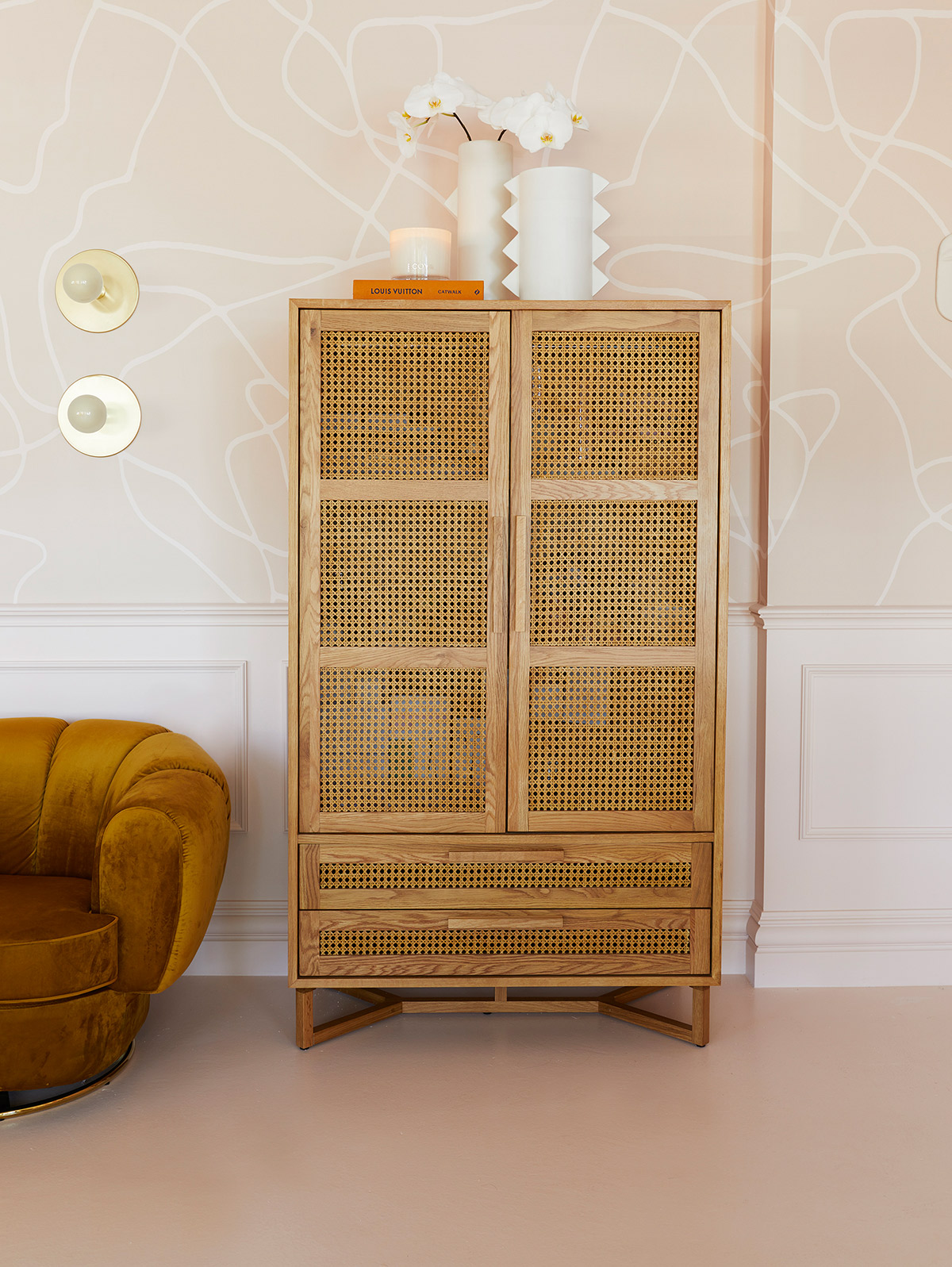
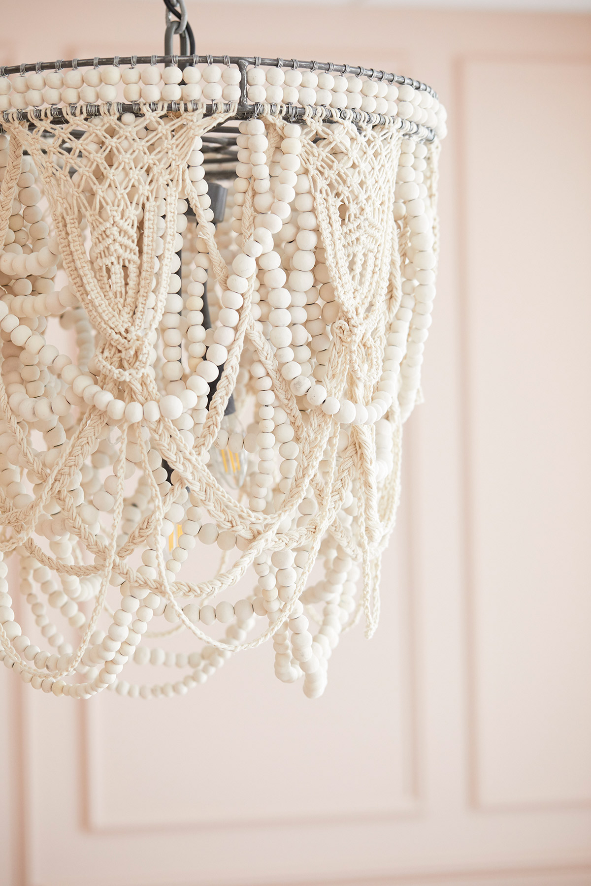
Our office really needed a lot of texture to break up the pink on pink paint combo so we brought this in using rugs, rattan chairs and cupboards, panelled walls and whimsical Luxaflex blinds. Our Klaylife chandelier was even a bit more textured than usual with macrame from Three Queens Interiors weaved amongst the mud beads.
Pops of Colour
It’s no secret that I’m a big fan of white, but that doesn’t mean I don’t love colour. I do - really!
You may say that this office is one big pop of colour! Pink on pink is probably not the obvious choice of colour palette you’d expect for an office space. Some may say it looks more like a glam lounge room, but I wanted our Three Birds HQ to be like a home away from home for us and our staff to enjoy. Here’s how we chose the colour palette and why it works for us …
When you think of the colour pink, bright, lolly shades probably come to mind - but my vision was for pink with some grunt! Pink with some grit! A dirty blush base for a gritty pretty space.
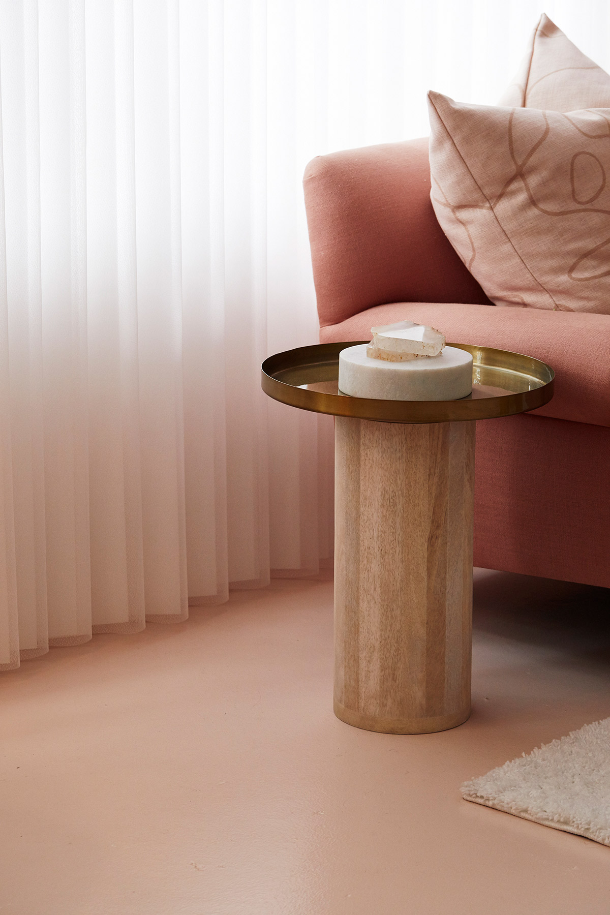
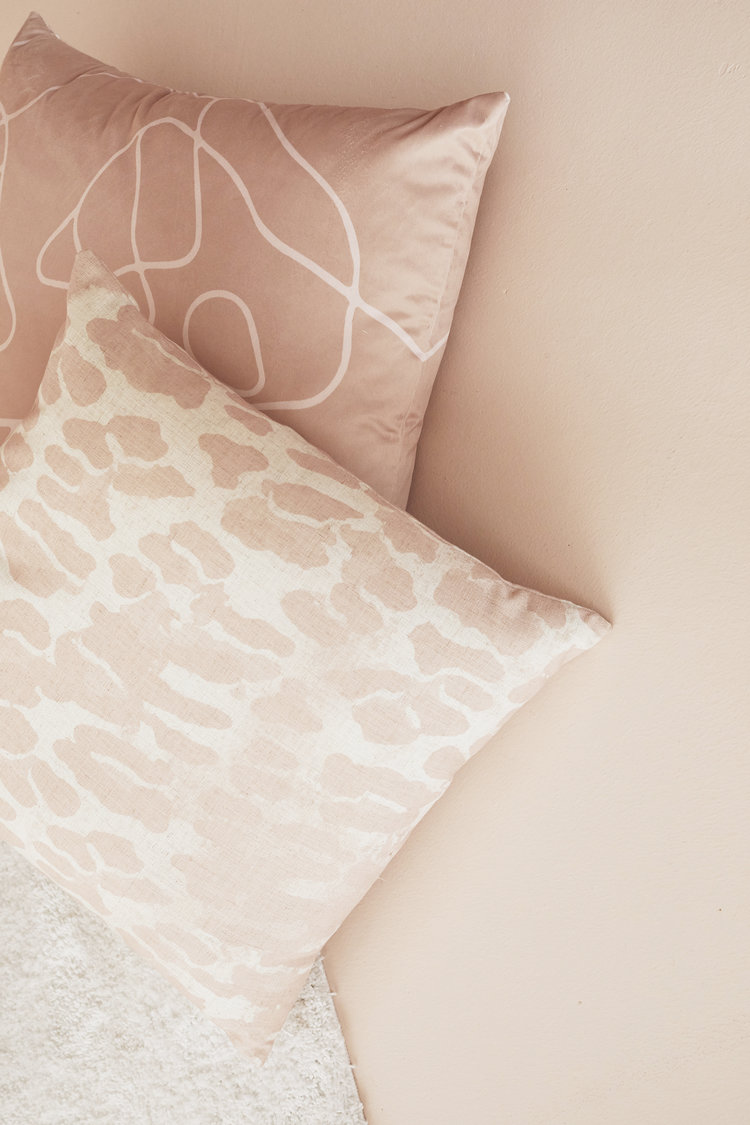
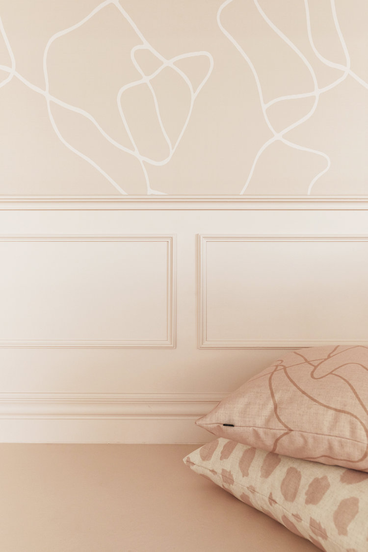
Dulux Maiko and Dulux Ellen Half were the first samples pots we tried on the walls and, lucky for us, they just worked perfectly together. Gotta love it when that happens! I’ve always loved these shades and they’re bang on trend for this season too. Why did we choose two shades rather than just one? I wanted some variation in the depth of pink and decided to use the darker pink, called‘Maiko’, for the walls and cabinetry at each end of the office and the lighter shade ‘Ellen Half’ for the panels on the long walls underneath the wallpaper. Our lovely friend and textiles queen Grace Garrett combined the two shades (cos she’s super clever) to create the pattern for the wallpaper, which she later replicated for the lounge and floor cushions. Oh and did you notice we also painted the floor pink?! #yeswayrose
And who knew that concrete could throw pink tones!? Not me! But the ‘Topus Concrete’ stone we chose for the kitchen benchtop and splashback is from Casesarstone’s newly released range and is a great example of how one finish can reflect many different tones in its environment. This one definitely is picking up the pink vibes we’re putting down.
Mastering Balance
Creating balance in a space isn’t necessarily about placing matching objects on either side of the room to create perfect symmetry. In fact, I don’t often follow that rule. For me, balance is about distributing the visual weight in a room, and though this can be done with symmetry, that sort of arrangement can sometimes feel more formal.
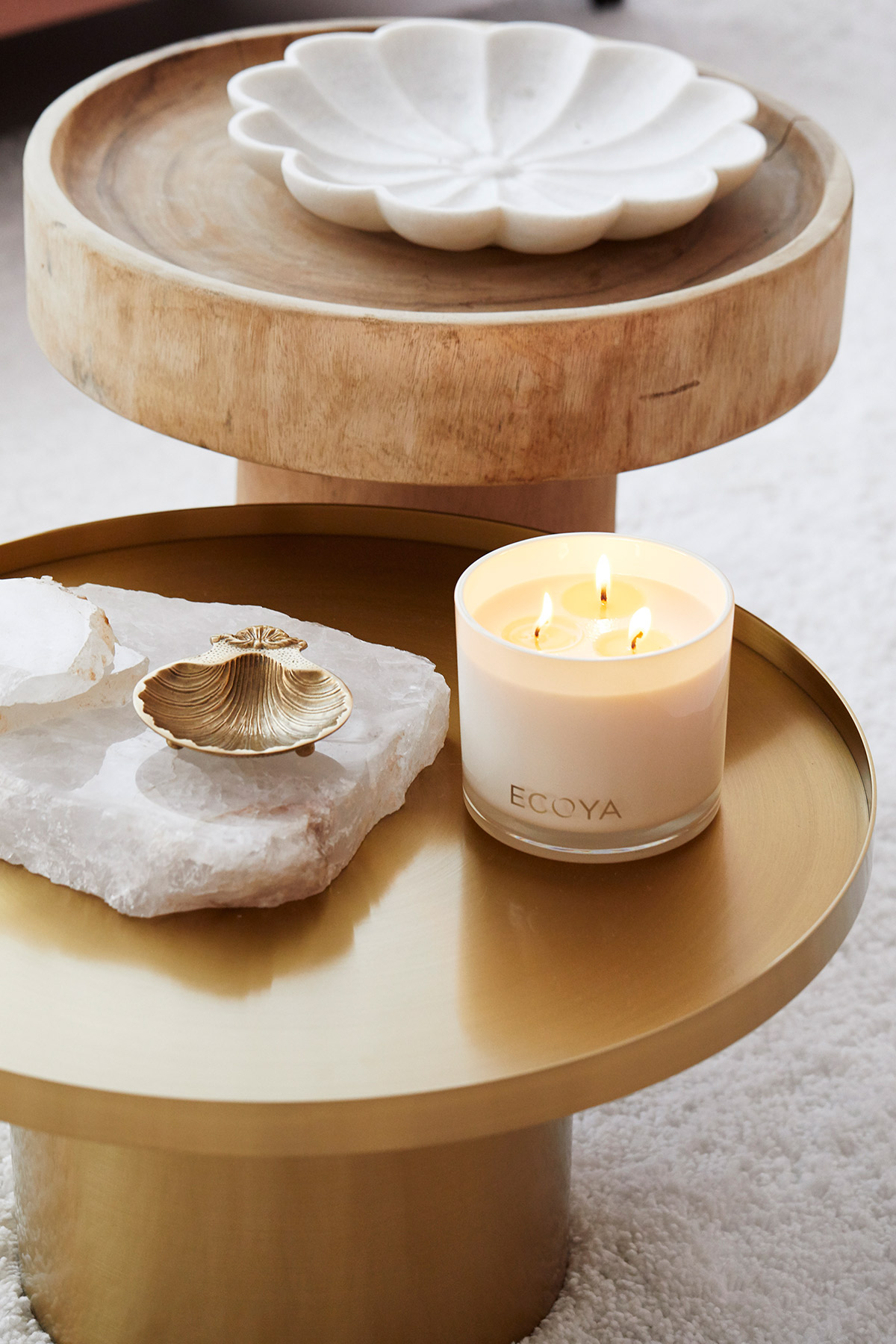
In our office, we created 3 distinct work spaces located around the open-plan room, and we often congregate in the little kitchen area as well. Asymmetrical balance brings a sense of casual living to this room, which is why I love using it. Each of these spaces is styled with clusters of objects… candles, cushions, trinkets. There’s definitely no symmetry in this room!
ALL THOSE FEELS
The most important aspect of design to me is how a room makes you FEEL. Not how it looks … but how it makes you FEEL. The overall feel of a room isn’t just set visually, but by how we interact with the space and the mood it puts us in. Even the scent of a room helps set the tone for how you want to feel in it. Scent can inspire creativity, elevate everyday moments and create everyday luxuries… even when you’re knee deep in budgets and timelines! Scent can inspire creative thought and create a calming space to drive productivity.
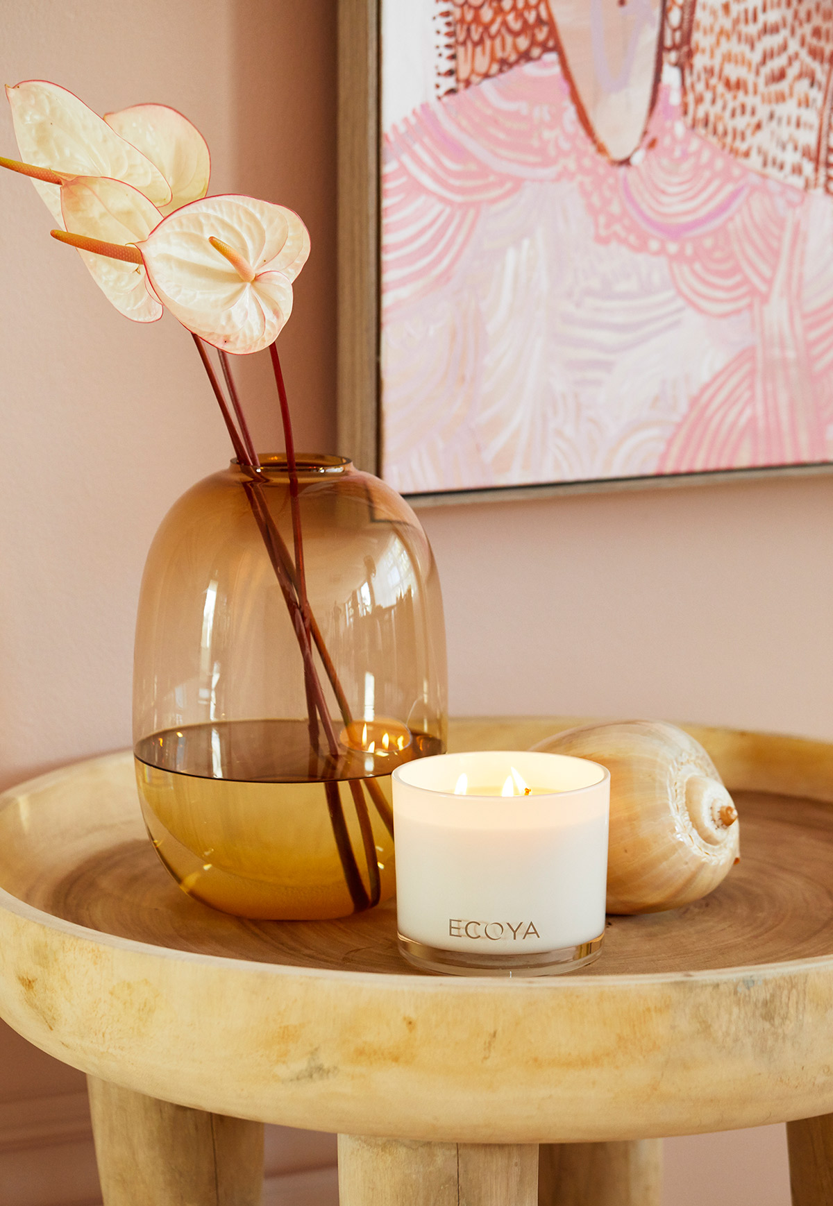
We’ve always loved fragrance in the office and the first person to arrive for work at Three Birds HQ usually lights the candles. But we’ve found out the hard way that not all candles are created equal! We chose ECOYA Candles for our office makeover space. They are made from natural soy wax, which has a cleaner burn and they also have a cooler burn temperature, so they last longer.
Tip: Candles are my number one ‘go-to’ styling product. Even when they’re not lit, they work well in almost every room I can think of. A garage is probably the only place I haven’t put a candle in yet … but never say never!


