HOW THIS HAMPTONS KITCHEN MEASURES UP
BY ERIN
We like to think of the kitchen as the heart of the home and this home really needed some focus on its heart health! The kitchen was dark and pokey, positioned in the middle of the house and just way too small for a family of five. She was crying out for a full overhaul!
I love how this new kitchen turned out - it’s probably my favourite.
Let’s take a look at how we whipped her into shape…
The Vital Stats
One of the first things we do when rejigging any floorplan is to relocate the kitchen as near as possible to the outdoor entertaining area. It just makes sense that it’s in close proximity for taking food out of the fridge to the BBQ chef and to watch the kids in the garden. It also means that when you’re in the kitchen you’ll never feel like you’re missing out on the action.
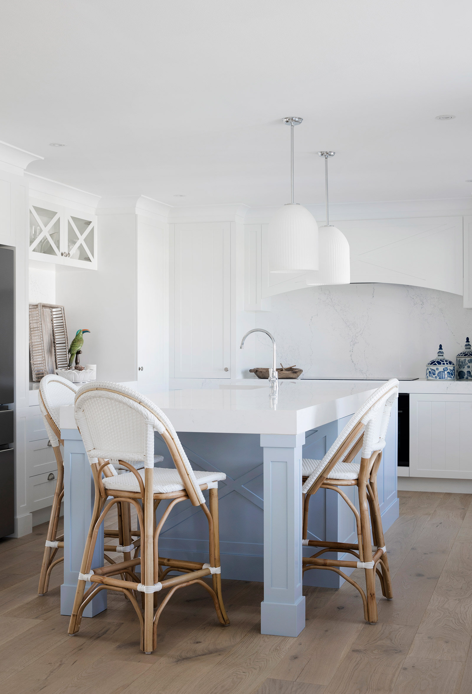
At 6m x 4m, the new kitchen is double the previous size, which allowed us to make the island bench an impressive 3m long x 1.1m wide. This doesn’t include the dining nook which is another 2.8m x 2m of dedicated dining space.
The Cabinetry
A few houses back, Lana tried to ban Bon from talking about “kitchen cabinetry that looks like furniture”. But try to stop her! That was her brief to our kitchen design wizard, Ronnie from Carrera by Design for this kitchen too. And I get why.
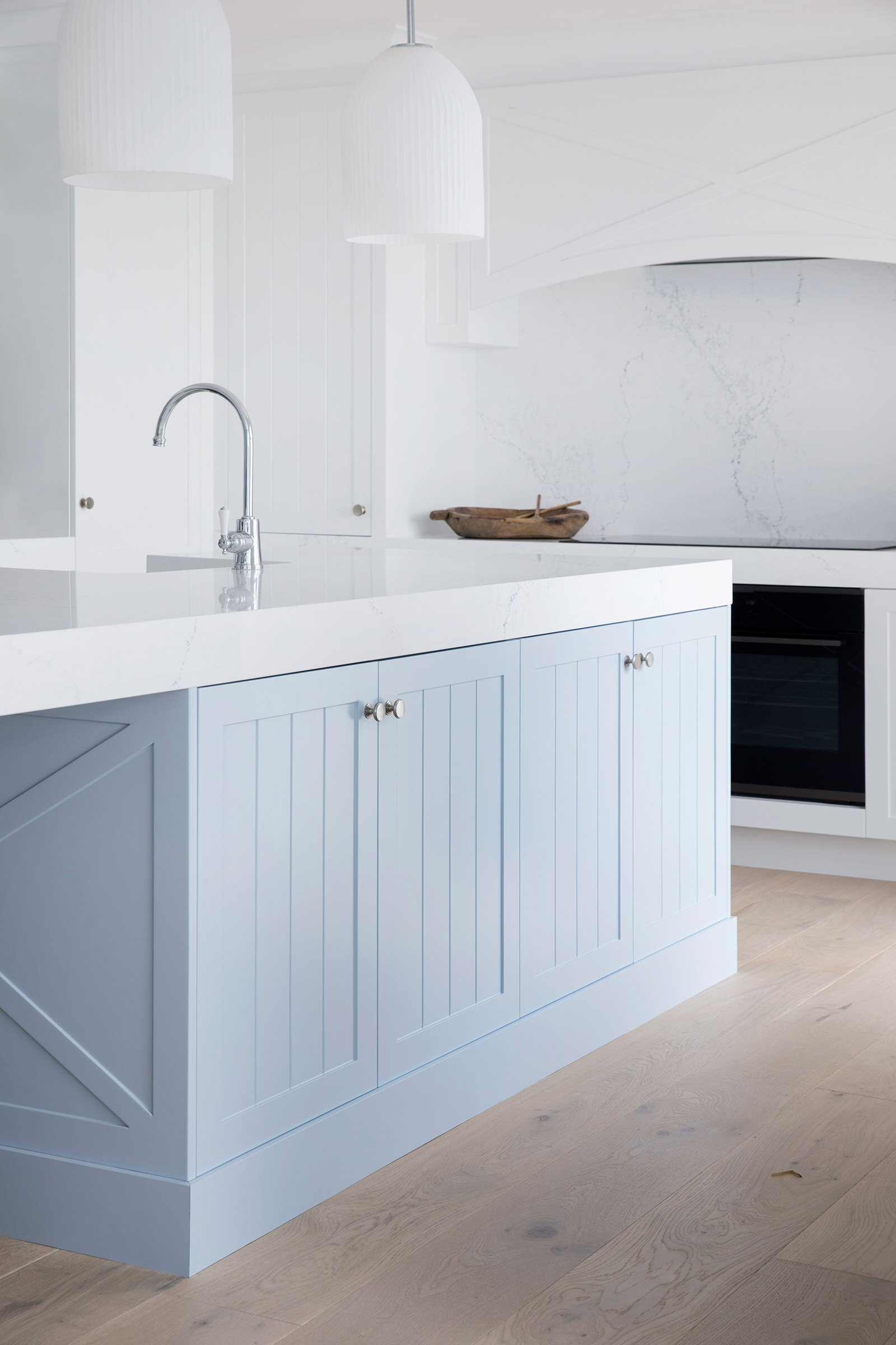
There’s something about big, chunky pieces of cabinetry that look like they could be standalone pieces. They add so much character and charm, especially with the details we added in this Hamptons kitchen like the v-groove panelling and cross hatches.
Bon toyed with the idea of forgoing handles on the cabinetry for shark nose pulls, like we did in Lana’s kitchen, but lost the love after referring to our vision board and discovering some gorgeous satin chrome knobs and shell cup handles from Domino Architectural Fittings. Hamptons kitchens typically have a combination of handles and knobs and we wanted to stay authentic to the vision.
With our benchtops, we actually changed out mind on this one and I can’t blame Bon on this occasion. We’d chosen Calacatta Nuvo for the but when Caesarstone went and released the stunning, fresh, Empira White, we made a quick switcharoo! It was whiter, brighter and the better choice for this kitchen. The 100mm thickness balances out the chunky legs of the island bench.
And how about that dreamy powder blue island colour? That’s Angora Blue by Dulux.
The Dining Nook
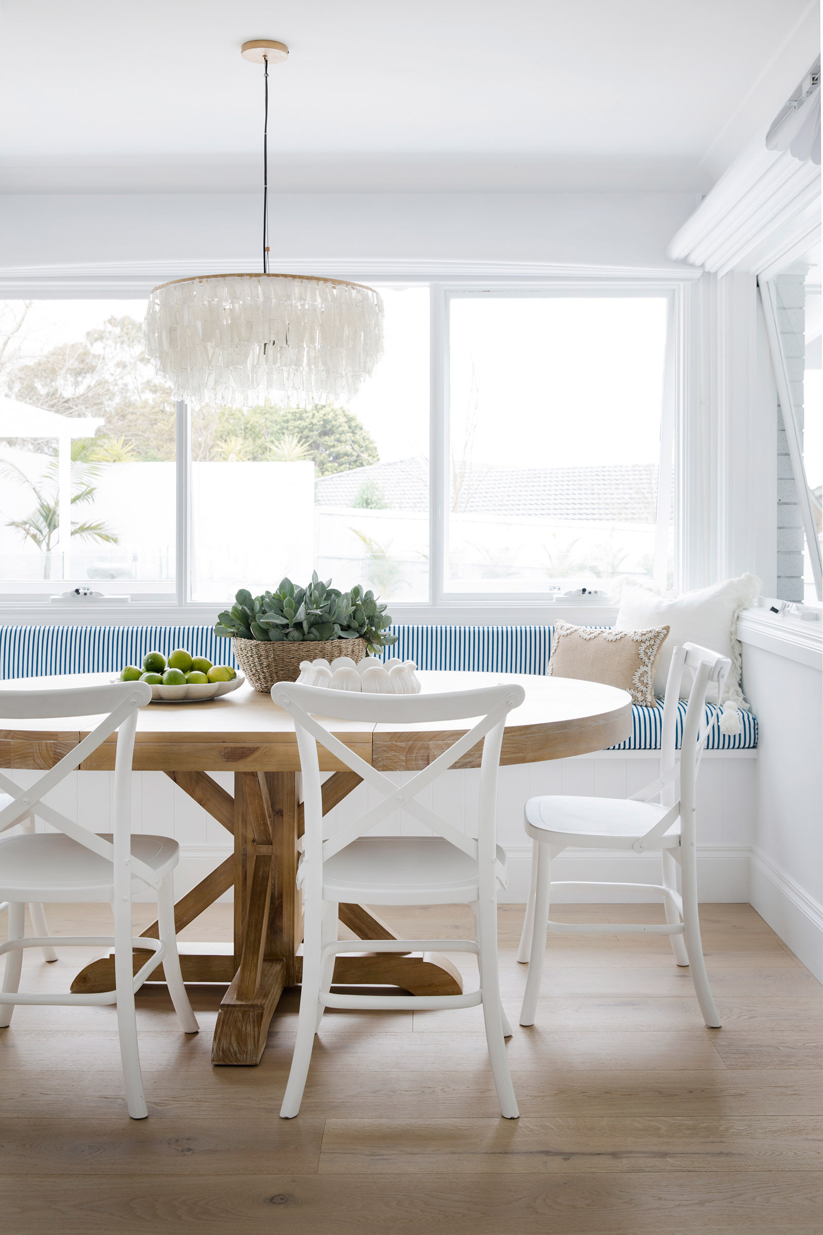
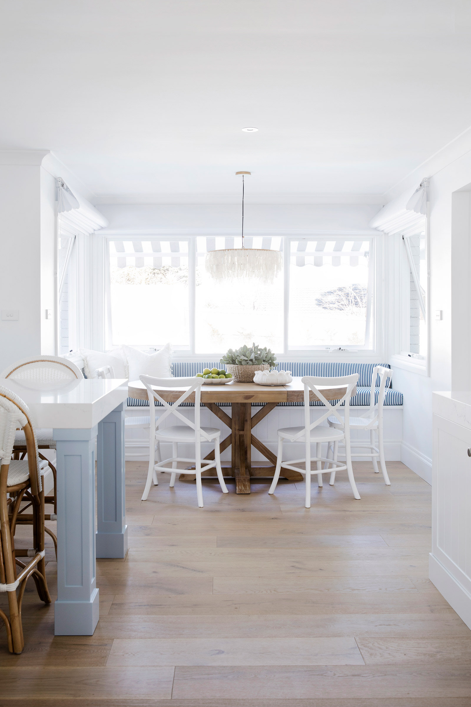
There was already a dining nook attached to the existing kitchen of this home so we decided to keep it to create an eat-in kitchen, with multiple places to sit, rather than just the island bench seating. Multiple seating configurations are really handy for busy households so that there’s room for different people to be doing different activities at the same time. Feeling like perching at the island bench with a drink? Or sitting down in the dining nook with the paper? Take your pick! There are plenty of seating options for everyone.
We gave the dining nook a cosmetic revamp, including a built-in a bench seat to maximise bums on seats. It’s 2.8m long and can fit fair few kids along it. That’s HardieGroove cladding detail tucked underneath.
The oval table from Freedom fits another four seats around it and is also extendable, so could go even larger in your home if you have the space.
The Great Wall of Windows
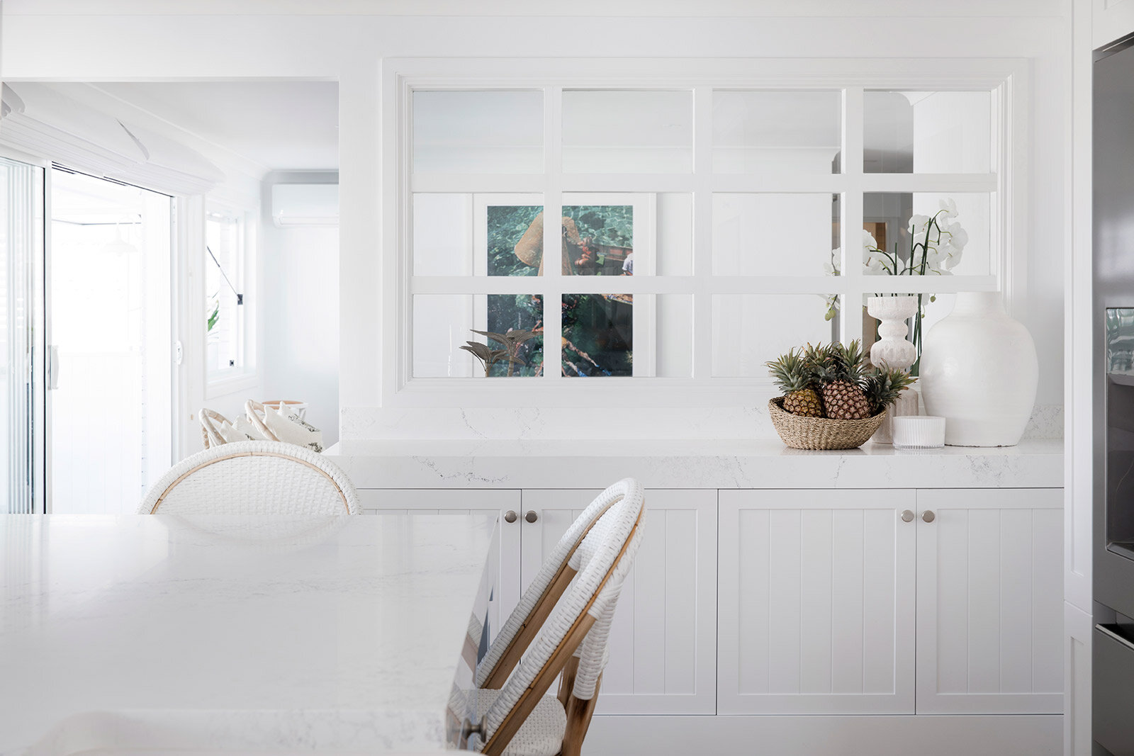
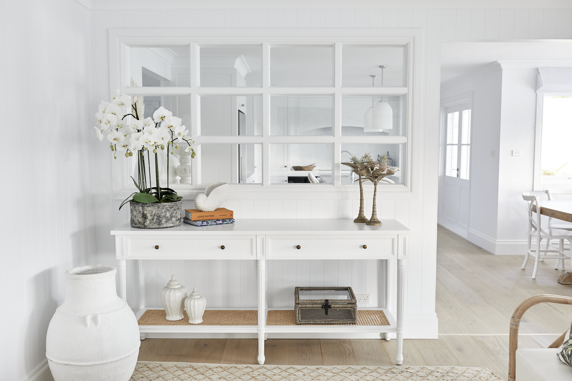
The owners wanted open plan living, but with a structural wall smack bang in the middle of the kitchen and living spaces, we had to get creative. Bon had a stroke of genius with the Great Wall of Windows, which lets in all the light and gives a full view into the lounge space, without removing the wall.
The window wall is positioned at a height that we could fit a built-in buffet underneath it on the kitchen side. This unit is 2.4m wide x 580cm deep and it’s topped with the same Empira White Caesarstone as the rest of the kitchen. It adds so much extra storage and the top will be a great serving bench when entertaining.
The Appliances
We chose the massive 681L capacity, Electrolux French door fridge to make sure there’s enough room day-to-day and when the family entertain. This beauty is crammed with all the latest features, like Wi-Fi, so that you adjust the temperature remotely and the continuous ice and water feature on the front door are always a hit with families. It’s also smudge-resistant stainless steel so they won’t be constantly wiping finger prints.
We love a game of ‘spot the integrated dishwasher’. This one’s perfectly hidden but practically placed to the right of the sink in the island bench. This is the third house that we’ve used the Electrolux RealLife XXL dishwasher because it’s so clever. The door pops open a few cm at the end of the cycle for maximum drying performance and it’s 25% bigger than your average dishwasher, which is always a good thing for a large family.
The oven and microwave are tucked under the induction cooktop.
I love the cross detail on the bulkhead which disguises the rangehood. It’s these little details that make all the difference!
We can’t wait to show you the owners’ reactions when they see their new kitchen.
Will they give it a glowing bill of health?


